• SONAR
  • UGLY UI... SpLat 2016.5 (p.14)
2016/05/29 16:33:16
Unknowen
karhide
Not my problem because my UI looks pretty good but your screen shot looks set like it has been processed in some other way. Have you reset all your settings back to the default?

Well then put up your screen...
2016/05/29 16:45:07
karhide
I will in the morning but everything is turned off for the evening. But you did not answer the question...
2016/05/29 16:45:42
chuckebaby
never mind
blocked


2016/05/29 16:46:41
SilkTone
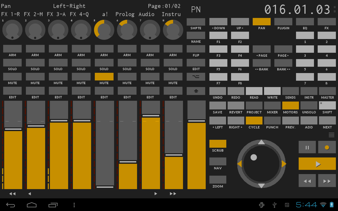
This thread got a bit too intense so not sure if we can have a rational discussion, but as I mentioned before I have a different issue with Tungsten. The loss of depth cues is significant, let me show these two screenshots of TouchDAW, which matches Tungsten's colors very closely:


[Sorry they are scaled down in the forum. The original images are here and here]
 
The two use the exact same colors. But to me the top one is not only ugly, but the fact that there are no depth cues required the designer to use highly contrasting colors so that you can see where one thing ends and another starts. In the bottom image, the need for highly contrasting colors is reduced dramatically because it takes your mind a fraction of a second to clearly identify each control. I can tell immediately what I can interact with without needing to consciously think about it 1st. Anything that is raised is interactable.
 
What I would love is a non-flat Tungsten theme similar to what the 2nd screenshot looks like. Until then I'll stick to Mercury.
 
BTW, did anyone see that Panu posted on the Sonar Mods Facebook page that the Tungsten theme looks "surprisingly like my Dark Side mod with EXE colors". I don't use Duckbar so I'm not familiar with Panu's work.
2016/05/29 16:59:30
Unknowen
chuckebaby
Dave, go make some music man.
seriously, this is getting old.


No Music for 2 weeks :( just killing time... TOO much stuff going on this week... multi tasking anyhow... lol  ;)
over and out! :)
 
2016/05/29 18:05:56
aghschwabe
Dave000
BTW... people not in the software field don't realize that most programmers don't believe that they need artists...
FACT!


Most users don't want to pay what it costs to have professional graphics developed...FACT!
 
If there were no other updates, the darker Titanium would be just fine with me (I've lived with the vanilla for this long after all).
 
Seriously, Dave, we're all very glad you don't like the new theme. It's three clicks to switch back to vanilla and let those of us who enjoy Titanium (I'm holding out for a Blue Steel or Magnum too), enjoy it.
 
I find it a lot easier to use, and it looks more familiar because things like the knob-sweep indicators are becoming a standard visual language in so many VSTs now.
 
This is one of those weird cases where the complaint is a non-complaint: "I don't like that thing that you're not forcing me to use!!!"
 
*shrug*

ps: thx for the update bakers!
2016/05/29 19:02:00
townstra
As long as I can still see it and record in it I don't care what color they make it.  I was fine with the last version and I like this one too.  Sonar has come a long way in the last few years.
2016/05/29 19:02:35
John
ampfixer
Don't lock it. The powers that be have let the other threads run their course and this one is interesting. People are talking about a new feature. Those on the fringe are easily identified and have some good points to make. If YOU don't like the thread then don't read it.
 
The customizable interface was a feature many of us have been longing for since it was announced. I don't think it was delivered as promised and want to see some discussion about it. One new colour scheme does not equal a customizable UI.


I have to read the thread I'm a host. My job in part is to stop personal attacks. Your response was fine until you said don't read the thread. I would refrain in future from telling a host to not read something. 
2016/05/29 22:11:01
ampfixer
You're a host John not a minor deity. Hubris does not become you.
2016/05/29 23:17:47
thaddeusjon
The new Sonar Tungsten reminds me of PreSonus Studio One 3. The difference between the two are the graphic detail of the dails in Sonar versus Studio One.
I like it, just wished when you color code in Tungsten, it would've became the color within a black background on the entire track in console view.
Awesome job, Bakers...
© 2026 APG vNext Commercial Version 5.1

Use My Existing Forum Account

Use My Social Media Account