Singular Consciousness
Max Output Level: -90 dBFS

- Total Posts : 22
- Joined: 2015/01/19 13:01:54
- Status: offline
dated looking inner gui
i don't want to sound critical of sonar, im just simply asking why when i click on the menu, sonar shows a very dated pixel art looking interface. is this going to be phased out overtime to match the beautiful vector interface on the main gui? or are these hard coded into the interface and can't be removed.
|
RobertB
Max Output Level: 0 dBFS

- Total Posts : 11256
- Joined: 2005/11/19 23:40:50
- Location: Fort Worth, Texas
- Status: offline

Re: dated looking inner gui
2015/03/10 23:29:32
(permalink)
OK, I'll bite.
What are you looking at?
My Soundclick Page SONAR Professional, X3eStudio,W7 64bit, AMD Athlon IIx4 2.8Ghz, 4GB RAM, 64bit, AKAI EIE Pro, Nektar Impact LX61,Alesis DM6,Alesis ControlPad,Yamaha MG10/2,Alesis M1Mk2 monitors,Samson Servo300,assorted guitars,Lava Lamp Shimozu-Kushiari or Bob
|
Splat 
Max Output Level: 0 dBFS
- Total Posts : 8672
- Joined: 2010/12/29 15:28:29
- Location: Mars.
- Status: offline
Re: dated looking inner gui
2015/03/11 00:08:11
(permalink)
I think this is a feature request. I for one would like to see the menu's revised, put in a slightly more logical order, and made beautiful esp for touch screen users (desktop users should be able to be use it perfectly as well). Think Quadcurve in terms of pretty. Think Sonitus in terms of usability. Pretty and usability come hand in hand otherwise it's a #fail. Also pretty = sales (sad to say) as Native Instruments well know.
post edited by Splat - 2015/03/11 00:15:46
Sell by date at 9000 posts. Do not feed. @48/24 & 128 buffers latency is 367 with offset of 38. Sonar Platinum(64 bit),Win 8.1(64 bit),Saffire Pro 40(Firewire),Mix Control = 3.4,Firewire=VIA,Dell Studio XPS 8100(Intel Core i7 CPU 2.93 Ghz/16 Gb),4 x Seagate ST31500341AS (mirrored),GeForce GTX 460,Yamaha DGX-505 keyboard,Roland A-300PRO,Roland SPD-30 V2,FD-8,Triggera Krigg,Shure SM7B,Yamaha HS5.Maschine Studio+Komplete 9 Ultimate+Kontrol Z1.Addictive Keys,Izotope Nectar elements,Overloud Bundle,Geist.Acronis True Image 2014.
|
John T
Max Output Level: -7.5 dBFS

- Total Posts : 6783
- Joined: 2006/06/12 10:24:39
- Status: offline
Re: dated looking inner gui
2015/03/11 09:37:29
(permalink)
Good god no. There's an OS-wide standard for menu form and function. A special Sonar-only menu system would be both a colossal waste of development time, and inevitably less complete and easy to use than the standardised Windows one.
http://johntatlockaudio.com/Self-build PC // 16GB RAM // i7 3770k @ 3.5 Ghz // Nofan 0dB cooler // ASUS P8-Z77 V Pro motherboard // Intel x-25m SSD System Drive // Seagate RAID Array Audio Drive // Windows 10 64 bit // Sonar Platinum (64 bit) // Sonar VS-700 // M-Audio Keystation Pro 88 // KRK RP-6 Monitors // and a bunch of other stuff
|
Beepster
Max Output Level: 0 dBFS
- Total Posts : 18001
- Joined: 2012/05/11 19:11:24
- Status: offline
Re: dated looking inner gui
2015/03/11 10:07:12
(permalink)
|
BobF
Max Output Level: 0 dBFS
- Total Posts : 8124
- Joined: 2003/11/05 18:43:11
- Location: Missouri - USA
- Status: offline
Re: dated looking inner gui
2015/03/11 10:23:22
(permalink)
There are quite a few things I would prefer to see dev time spent. I've never thought that a GUI needs to look like Optimus Prime's taint to be useful.
Bob -- Angels are crying because truth has died ...Illegitimi non carborundum --Studio One Pro / i7-6700@3.80GHZ, 32GB Win 10 Pro x64 Roland FA06, LX61+, Fishman Tripleplay, FaderPort, US-16x08 + ARC2.5/Event PS8s Waves Gold/IKM Max/Nomad Factory IS3/K11U
|
stickman393
Max Output Level: -60 dBFS

- Total Posts : 1528
- Joined: 2003/11/07 18:35:26
- Status: offline
Re: dated looking inner gui
2015/03/11 10:39:47
(permalink)
John T
Good god no. There's an OS-wide standard for menu form and function. A special Sonar-only menu system would be both a colossal waste of development time, and inevitably less complete and easy to use than the standardised Windows one.
To quote Douglas Adams: "There are some who say that this has already happened."
|
Anderton
Max Output Level: 0 dBFS
- Total Posts : 14070
- Joined: 2003/11/06 14:02:03
- Status: offline
Re: dated looking inner gui
2015/03/11 11:20:44
(permalink)
Besides, you don't stay on a menu item. You select an item, then the menu goes away and crawls back into its hole.
|
SquareSpiral
Max Output Level: -89 dBFS

- Total Posts : 86
- Joined: 2014/12/27 08:20:30
- Status: offline
Re: dated looking inner gui
2015/03/11 20:02:27
(permalink)
Not a fan of customised menus - just becomes more brain drain as you switch between programs trying to remember the specifics of each one. Often becomes design for designs sake.
|
jb101
Max Output Level: -46 dBFS

- Total Posts : 2946
- Joined: 2011/12/04 05:26:10
- Status: offline
Re: dated looking inner gui
2015/03/11 20:10:26
(permalink)
John T
Good god no. There's an OS-wide standard for menu form and function. A special Sonar-only menu system would be both a colossal waste of development time, and inevitably less complete and easy to use than the standardised Windows one.
What John T said.
|
John
Forum Host

- Total Posts : 30467
- Joined: 2003/11/06 11:53:17
- Status: offline
Re: dated looking inner gui
2015/03/11 20:58:21
(permalink)
As long as they are readable and understandable there is nothing to fix.
|
jih64
Max Output Level: -75 dBFS

- Total Posts : 797
- Joined: 2014/01/30 20:59:40
- Location: Studio One 3
- Status: offline
Re: dated looking inner gui
2015/03/11 22:06:51
(permalink)
John
As long as they are readable and understandable there is nothing to fix.
+1 But if enough people want it, I guess the 'old' menu is already there, so maybe we could have both, an option for those who want the menu's as is, and one for those who don't. But I can't help thinking that it could be better to concentrate on other things
|
Dave Modisette
Max Output Level: 0 dBFS
- Total Posts : 11050
- Joined: 2003/11/13 22:12:55
- Location: Brandon, Florida
- Status: offline
Re: dated looking inner gui
2015/03/12 09:50:52
(permalink)
I'd have to see a vector style drop down window to know whether it would be a hill worth dying for. But, if the vector style menu had friendly names for mono inputs and outputs, I'd be all over it. 
|
js516
Max Output Level: -84 dBFS

- Total Posts : 347
- Joined: 2006/05/17 15:14:53
- Status: offline
Re: dated looking inner gui
2015/03/12 12:31:25
(permalink)
If you have used the latest of Microsoft products, you'd notice that menus have been replaced by ribbons and quick access toolbars. So as far as "Windows standard" goes, old style drop down menus are no longer it.
Joe Sera Gigabyte GA-990FXA-UD3, AMD FX-8320, Corsair 32GB 1600 Ram, MOTU AVB on USB3, AMD Radeon R7-200
|
ampfixer
Max Output Level: -20 dBFS

- Total Posts : 5508
- Joined: 2010/12/12 20:11:50
- Location: Ontario
- Status: offline
Re: dated looking inner gui
2015/03/12 13:36:22
(permalink)
I hate the newest MS office because of its look and feel. Lets hope they don't copy it completely.
Regards, John I want to make it clear that I am an Eedjit. I have no direct, or indirect, knowledge of business, the music industry, forum threads or the meaning of life. I know about amps. WIN 10 Pro X64, I7-3770k 16 gigs, ASUS Z77 pro, AMD 7950 3 gig, Steinberg UR44, A-Pro 500, Sonar Platinum, KRK Rokit 6
|
Beepster
Max Output Level: 0 dBFS
- Total Posts : 18001
- Joined: 2012/05/11 19:11:24
- Status: offline
Re: dated looking inner gui
2015/03/12 14:17:43
(permalink)
Since this seems to be drifting into possible encouragement for such "change for the sake of change"/"form over function" territory I would like to reiterate my opposition to altering the standard menus visually (which was rather glib).
When I am looking at those neat, dry and professional dropdowns I know I am looking at the true functions of a program. Not the candy coated, "user friendly" (those, BTW would be sarcastic air quotes if you could see me right now) graphical bobbles that seem to be eroding away at our beloved programs and websites.
I appreciate that Cake needs to appeal to the vapid visual generation who have been rewarded with endorphin fixes of interacting with the shiny coins, jewels, upset avians, etc, via their light boxes within virtual realities filled with princesses and neer do well dragons or Axis forces waiting to have their helmets popped off their noggins. There is however enough flash, dash and endorphin rushes provided by musical production and the main GUI is pretty "bling" filled as it is I think we can do without such frivolities added to the default menus.
If this is even for a second considered for development please make it an optional feature that can be disabled or much preferably, for the sake of not introducing a bunch of unnecessary graphical bugs to the core program for us doddering "dinosaurs", a completely separate add on that integrates with the core program (not the other way around). Let the video game kids deal with any fallout from glitches and leave us boring, but happy, menu dwellers work in peace.
Please?
kthxbye
|
OldTimerNewComer
Max Output Level: -87 dBFS

- Total Posts : 164
- Joined: 2011/02/24 14:03:28
- Status: offline
Re: dated looking inner gui
2015/03/12 15:04:51
(permalink)
Beepster
No... just, no.
SquareSpiral
Not a fan of customised menus - just becomes more brain drain as you switch between programs trying to remember the specifics of each one. Often becomes design for designs sake.
jb101
John T
Good god no. There's an OS-wide standard for menu form and function. A special Sonar-only menu system would be both a colossal waste of development time, and inevitably less complete and easy to use than the standardised Windows one.
What John T said.
....What THEY said. I wonder how people who are constantly finding fault and posting ( YKWYA...) get any work done....lol Mel
Asus Sabertooth Z77. OCZ "Stealth" PSU 700w. Core i7 2600k @3.8 Ghz via XMP memory setting. AMD Radeon HD6450 CE 2GB DDR3 video. Corsair DDR3 1600Mhz (32 Gig). Kingston 512 GB SSD(OS/Software). WD 500 GB SATA(data) + 1 TB external. Focusrite Saffire Pro 40(FW)-v3.4. Windows 10 Pro Sonar Platinum Jamaica Plains Update ________________________________________ Ultimately YOU will be the hardest to convince that the Cake is done... Finish it. My Stuff: https://www.reverbnation.com/skeletonkrew9
|
sharke
Max Output Level: 0 dBFS
- Total Posts : 13933
- Joined: 2012/08/03 00:13:00
- Location: NYC
- Status: offline
Re: dated looking inner gui
2015/03/12 15:10:22
(permalink)
Which DAW's have better looking menus?
JamesWindows 10, Sonar SPlat (64-bit), Intel i7-4930K, 32GB RAM, RME Babyface, AKAI MPK Mini, Roland A-800 Pro, Focusrite VRM Box, Komplete 10 Ultimate, 2012 American Telecaster!
|
Anderton
Max Output Level: 0 dBFS
- Total Posts : 14070
- Joined: 2003/11/06 14:02:03
- Status: offline
Re: dated looking inner gui
2015/03/12 15:21:50
(permalink)
I didn't take the OP as whining, but wanting the menus to have the same kind of classy GUI as Skylight. But yes, they really are different components and there's not much that can be done about it that's simple.
|
Beepster
Max Output Level: 0 dBFS
- Total Posts : 18001
- Joined: 2012/05/11 19:11:24
- Status: offline
Re: dated looking inner gui
2015/03/12 15:45:06
(permalink)
Anderton
I didn't take the OP as whining, but wanting the menus to have the same kind of classy GUI as Skylight. But yes, they really are different components and there's not much that can be done about it that's simple.
Nor did I really and I probably should have been less of a dink. I just really don't like the idea for my own personal system. I'd almost kind of like the option of having the Browser revert to more of a Windows shell when looking at files. It actually took me a while to realize that when browsing media in the Browser I was actually just looking at my Windows directories... which is dumb I know but I really did not know much about computers when I hopped on the Sonar train.
|
swamptooth
Max Output Level: -53 dBFS

- Total Posts : 2229
- Joined: 2012/04/16 15:44:21
- Status: offline
Re: dated looking inner gui
2015/03/12 16:30:45
(permalink)
sharke
Which DAW's have better looking menus?
I'm pretty sure the OP is referring to menus inside the daw, like for picking a bus to send to and not the main menu bar. Here's a shot of submenus in both - Cubase on the left, Live on the right. The bakers have been making the entire gui skylight-themed, including the changes to graphics for autosnap in the platinum release, so this might be an area to improve as well. 
Arvid H. PetersonSonar X3E Prod / X2A / X1PE | Cubase 9.5.1 | Reason 9.5 | Sibelius7 | Pure DataNative-Instruments Komplete 10 Ultimate and a smattering of other pluginsHome-brewed VSTs Toshiba Satellite S855-S5378 (16GB RAM, modified with 2x 750GB HDDs, Windows 8.1 x64) Samson Graphite 49, M-Audio Oxygen 49, Korg nanoPAD2, Webcam motion tracking programs M-Audio Fast Track UltraMember, ASCAP
|
tlw
Max Output Level: -49.5 dBFS

- Total Posts : 2567
- Joined: 2008/10/11 22:06:32
- Location: West Midlands, UK
- Status: offline
Re: dated looking inner gui
2015/03/12 19:21:47
(permalink)
☄ Helpfulby John T 2015/03/12 21:30:15
The main pull-down application menus should be left well alone. There's a reason MS recommendeda standard approach. Once upon a time I had to use Lotus Notes and 123, which used their own menu system that was quite unlike the Windows standard and made switching between applications more confusing than it should have been.
I've also used custom-built software where the developer chose, for reasons unknown, not to stick to Windows hot keys, to break things like tabbing between data input fields, ignore the Windows API regarding right mouse button clicks and all sorts of strangeness. User friendly that approach is not.
As for the menus for assigning track inputs and outputs, I couldn't really care what colour they are. I'd much rather the development time was spent arranging for audio inputs to be shown in a better way than the confusing "left number1, right number 1, stereo number 1". Applying the way MIDI inputs can be named to audio ins and outs would be a more useful thing to change than the appearance of the menu,
Sonar Platinum 64bit, Windows 8.1 Pro 64bit, I7 3770K Ivybridge, 16GB Ram, Gigabyte Z77-D3H m/board, ATI 7750 graphics+ 1GB RAM, 2xIntel 520 series 220GB SSDs, 1 TB Samsung F3 + 1 TB WD HDDs, Seasonic fanless 460W psu, RME Fireface UFX, Focusrite Octopre. Assorted real synths, guitars, mandolins, diatonic accordions, percussion, fx and other stuff.
|
Blades
Max Output Level: -43 dBFS

- Total Posts : 3246
- Joined: 2003/11/06 08:22:52
- Location: Georgia
- Status: offline
Re: dated looking inner gui
2015/03/12 20:43:35
(permalink)
If they were to do something like this, I'd like to see it more akin to "skinning" the dropdowns that are presented by Windows than replacing the menuing system with a custom one. WindowBlinds has done this over the years for a ton of themes that really look pretty cool - if that's your sort of thing.
Breaking the Windows conventions would be a terrible idea though. For example, in our new helpdesk system, the drop down menus require that after we select the item, we click a little blue check mark to confirm the drop down menu choice. I almost forget to click that every time and it means that the drop down closes without my selection. It doesn't really serve a purpose, since you could just click the dropdown menu again and make a different selection. It's not like the GUI takes that selection from the dropdown and immediately acts on it - it just populates the selection anyway. So it's a waste of time and outside of the normal flow of how every other application treats a drop down menu.
Skinning would be the answer here, and I've got to imagine that it isn't that terribly hard to do. I DO have to say that I don't believe it's terribly necessary though.
|
John T
Max Output Level: -7.5 dBFS
- Total Posts : 6783
- Joined: 2006/06/12 10:24:39
- Status: offline
Re: dated looking inner gui
2015/03/12 21:31:56
(permalink)
I've long thought that one of the key strengths of Sonar, way back to when it wasn't even called Sonar, is that it's truly Windows native. If you can use WordPad, or MS Paint, you can, at a core fundamental level, use Sonar. That's what it has - on the Windows platform - over the multitude of DAWs that have their roots on Mac. Not saying either OS is better or worse than the other, but if you're a Windows user, then the fundamental Windows-ness of Sonar is a really positive quality.
http://johntatlockaudio.com/Self-build PC // 16GB RAM // i7 3770k @ 3.5 Ghz // Nofan 0dB cooler // ASUS P8-Z77 V Pro motherboard // Intel x-25m SSD System Drive // Seagate RAID Array Audio Drive // Windows 10 64 bit // Sonar Platinum (64 bit) // Sonar VS-700 // M-Audio Keystation Pro 88 // KRK RP-6 Monitors // and a bunch of other stuff
|
John T
Max Output Level: -7.5 dBFS
- Total Posts : 6783
- Joined: 2006/06/12 10:24:39
- Status: offline
Re: dated looking inner gui
2015/03/12 21:34:44
(permalink)
☄ Helpfulby tlw 2015/03/13 10:25:37
To give a different example of what I don't like: Izotope make some wonderful products, in terms of what they can do with audio. Ozone and RX are absolutely indispensable to me. However, not only do they have wacky non-standard UI, every Izotope product has a different wacky non-standard UI, and they change the non-standard UI of every product with every update. They're always beautiful looking, but it's a madman's breakfast, in terms of repeatable workflow.
http://johntatlockaudio.com/Self-build PC // 16GB RAM // i7 3770k @ 3.5 Ghz // Nofan 0dB cooler // ASUS P8-Z77 V Pro motherboard // Intel x-25m SSD System Drive // Seagate RAID Array Audio Drive // Windows 10 64 bit // Sonar Platinum (64 bit) // Sonar VS-700 // M-Audio Keystation Pro 88 // KRK RP-6 Monitors // and a bunch of other stuff
|
Singular Consciousness
Max Output Level: -90 dBFS
- Total Posts : 22
- Joined: 2015/01/19 13:01:54
- Status: offline
Re: dated looking inner gui
2015/03/12 23:19:59
(permalink)
☄ Helpfulby swamptooth 2015/03/13 01:27:03
well then oops. should not have mentioned it as the dinosaurs have spoken. oh wait, dinosaurs don't talk :)
|
John T
Max Output Level: -7.5 dBFS
- Total Posts : 6783
- Joined: 2006/06/12 10:24:39
- Status: offline
Re: dated looking inner gui
2015/03/12 23:49:07
(permalink)
Hmm.
It's okay to mention anything. A lack of universal agreement doesn't make anyone a dinosaur.
http://johntatlockaudio.com/Self-build PC // 16GB RAM // i7 3770k @ 3.5 Ghz // Nofan 0dB cooler // ASUS P8-Z77 V Pro motherboard // Intel x-25m SSD System Drive // Seagate RAID Array Audio Drive // Windows 10 64 bit // Sonar Platinum (64 bit) // Sonar VS-700 // M-Audio Keystation Pro 88 // KRK RP-6 Monitors // and a bunch of other stuff
|
Splat
Max Output Level: 0 dBFS
- Total Posts : 8672
- Joined: 2010/12/29 15:28:29
- Location: Mars.
- Status: offline
Re: dated looking inner gui
2015/03/13 00:06:06
(permalink)
John T
Good god no. There's an OS-wide standard for menu form and function. A special Sonar-only menu system would be both a colossal waste of development time, and inevitably less complete and easy to use than the standardised Windows one.
js516
If you have used the latest of Microsoft products, you'd notice that menus have been replaced by ribbons and quick access toolbars. So as far as "Windows standard" goes, old style drop down menus are no longer it.
Exactly there are multiple UI's for the developer to call upon which are standard. You can have old style Win 3.1 if you want ;) Let's forget the metro UI shall we ;) Think sales ladies and gentlemen..! Of course there are better things to do first, and like I said if a UI improvement makes things worst then there is no point.Pretty and usability should come hand in hand otherwise it's a #fail. That means don't make it pretty and make it less usable otherwise it will be a big screw up. However it is perfectly possible to make it pretty and easier to use. There is certainly a lot that can be done to improve the UI and usability. The big issue as everybody knows is people hate change (check this thread) and people hear more about bad UI changes rather than good ones, and people hate UI's that slow down their workflow that is a given. Some touchscreen UI's are a crime...because they screw the workflow. Old customers are perfectly happy I'm sure (like me) but Cakewalk needs more new customers.. Customers are looking for an experience nowadays It's not enough for instance for a phone to make one generic ringing sound. Yeah your Nokia was great but somebody else now sells more smart phones than anybody else... And the nearest rival also sells a shed load..
post edited by Splat - 2015/03/13 00:50:04
Sell by date at 9000 posts. Do not feed. @48/24 & 128 buffers latency is 367 with offset of 38. Sonar Platinum(64 bit),Win 8.1(64 bit),Saffire Pro 40(Firewire),Mix Control = 3.4,Firewire=VIA,Dell Studio XPS 8100(Intel Core i7 CPU 2.93 Ghz/16 Gb),4 x Seagate ST31500341AS (mirrored),GeForce GTX 460,Yamaha DGX-505 keyboard,Roland A-300PRO,Roland SPD-30 V2,FD-8,Triggera Krigg,Shure SM7B,Yamaha HS5.Maschine Studio+Komplete 9 Ultimate+Kontrol Z1.Addictive Keys,Izotope Nectar elements,Overloud Bundle,Geist.Acronis True Image 2014.
|
swamptooth
Max Output Level: -53 dBFS
- Total Posts : 2229
- Joined: 2012/04/16 15:44:21
- Status: offline
Re: dated looking inner gui
2015/03/13 01:37:30
(permalink)
Splat
Pretty and usability should come hand in hand otherwise it's a #fail.
True... now which is more useful from an insert fx on a track operation... 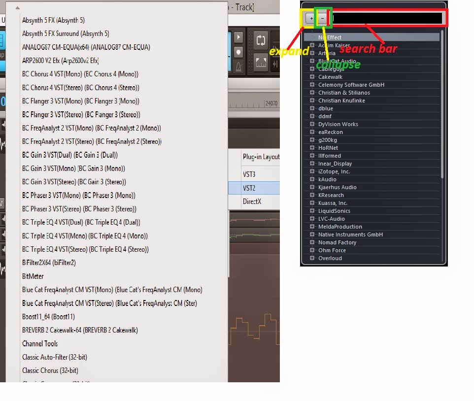
Arvid H. PetersonSonar X3E Prod / X2A / X1PE | Cubase 9.5.1 | Reason 9.5 | Sibelius7 | Pure DataNative-Instruments Komplete 10 Ultimate and a smattering of other pluginsHome-brewed VSTs Toshiba Satellite S855-S5378 (16GB RAM, modified with 2x 750GB HDDs, Windows 8.1 x64) Samson Graphite 49, M-Audio Oxygen 49, Korg nanoPAD2, Webcam motion tracking programs M-Audio Fast Track UltraMember, ASCAP
|
Brando
Max Output Level: -47.5 dBFS

- Total Posts : 2776
- Joined: 2003/11/06 11:47:20
- Location: Canada
- Status: offline
Re: dated looking inner gui
2015/03/13 13:13:04
(permalink)
swamptooth
Splat
Pretty and usability should come hand in hand otherwise it's a #fail.
True... now which is more useful from an insert fx on a track operation...
(Image removed)
Have to agree. But a lot of the problem in SONAR is the organization of the content of the menus. I was just working in ACT - the menu to assign a control to a controller is just a mess. A big, seemingly haphazard list, somewhat organized by type - none of which I can exclude or filter in any way - so I select the same item 8 different times by scrolling down a menu bar to an approximate location down the list, search, select, repeat. I don't care what the menus look like personally - but the content and organization are critical. Function over form, IMO.
Brando
Cakewalk, Studio One Pro, Reaper Presonus Audiobox 1818VSL ASUS Prime Z370-A LGA1151, 32GB DDR4, Intel 8700K i7, 500 GB SSD, 3 x 1TB HDD, Windows 10 Pro 64
|