I saw a project where they had updated all of Waves UI's...and MAN..they looked
GREAT. Sadly, they were just a "mock" UI to show how they could
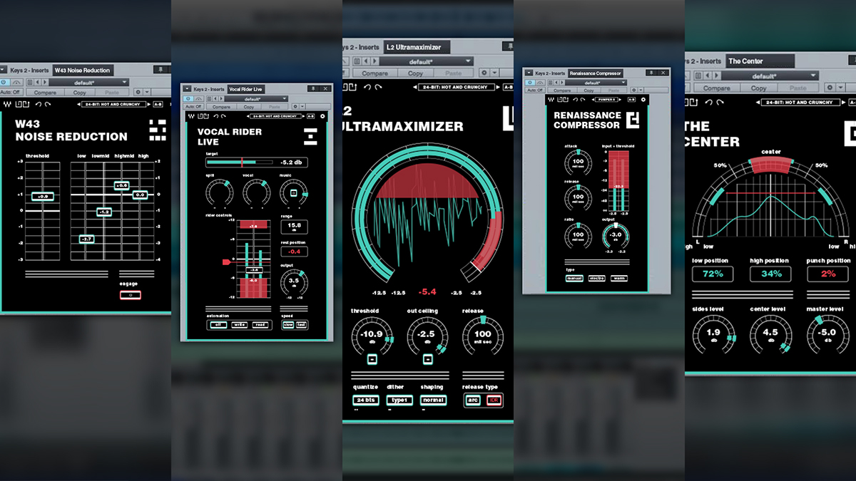
be improved...(see below)
Of course they work...we all know they work...but, UI's like the
L1, L2, L3, etc...and all those other plugins are just bleck....
YES...they work great...and obviously no effect on "functionality",
BUT, with many they are less then "user friendly", and they actually LOOK
HORRENDOUS. They work, and work well, but they LOOK TEDIOUS
AND HORRENDOUS!
It's kinda like saying "YES that girl over there will serve the purpose, because, after
all, it's just a face, but it still does the job...but, when you look at a "nice one"
you are far more inclined to say (and feel) "WOW", and the chance of "enjoying the experience"
is far greater!
Crude but effective "analogy"...
We are visual by nature, and if something is "aesthetically appealing" we are
far more inclined to be "responsive" to it...
Tell me you wouldn't much rather "work" with these - I know I would
here's the project page
https://www.behance.net/g...edesign-Thesis-Project