UnderTow
Max Output Level: -37 dBFS

- Total Posts : 3848
- Joined: 2004/01/06 12:13:49
- Status: offline

Re:X1 User interface looks cluttered!
2011/02/04 13:06:19
(permalink)
Some more musings:  Basically just copying the elements from the Control Bar Mix modules into the empty space above the Track Headers. (I need to do this better. Next version). And a track selector that shows / hides different track types (excuse the lost Envelope squiggle. Part of a different idea). Also Note that what used to be the Track Control Manager menu is now a Gloabal Edit Filter menu. In this case it is set to All which means that all track items are editable just like in previous versions of Sonar. Damn this takes a long time to do without having the actual X1 engine do some of the work for me... (As in, if a Cakewalk developer changes a single widget, they can recompile X1 with the new bitmap and X1 will replace all visible instances of the changed item. I need to painstakingly change every individual item and then re-align everything to fit etc...) UnderTow UnderTow
|
UnderTow
Max Output Level: -37 dBFS
- Total Posts : 3848
- Joined: 2004/01/06 12:13:49
- Status: offline
Re:X1 User interface looks cluttered!
2011/02/04 13:09:24
(permalink)
bermuda
I appreciate the effort you have put in , but to me personally , this is cluttered and all the colours would be very quickly headache inducing. Each to their own. Don't let my comment put you off your redesign.
Fair enough although I would like to point out it is only two extra colours.  (The Input Echo section will be removed at some point. I don't like it). And those colours could be set to the same blue as the rest. UnderTow
|
stickman393
Max Output Level: -60 dBFS

- Total Posts : 1528
- Joined: 2003/11/07 18:35:26
- Status: offline
Re:X1 User interface looks cluttered!
2011/02/04 13:19:32
(permalink)
Please stop. I'm going to start crying, for what we didn't get.
But seriously, I think it was a mistake to shrink the MSR,etc buttons that much. I think they are too small now.
|
Rothchild
Max Output Level: -61 dBFS

- Total Posts : 1479
- Joined: 2003/11/27 13:15:24
- Status: offline
Re:X1 User interface looks cluttered!
2011/02/04 13:20:34
(permalink)
Jekyll Vance
I appreciate the effort you have put in , but to me personally , this is cluttered and all the colours would be very quickly headache inducing
All colors must be customizable, like in S8.5, that's what we want anyway.
Yup, if we could change them those who wanted one colour could have it and those of us (me included) who value different colours, to help differentiate the controls from each other, could have them. Win + Win. Child
|
UnderTow
Max Output Level: -37 dBFS
- Total Posts : 3848
- Joined: 2004/01/06 12:13:49
- Status: offline
Re:X1 User interface looks cluttered!
2011/02/04 14:12:42
(permalink)
stickman393
But seriously, I think it was a mistake to shrink the MSR,etc buttons that much. I think they are too small now.
A fair point. Are you right clicking and viewing the images directly? They are scaled down by the forum software. (The forum makers thought it would be a good idea to make all pictures fuzzy by default. Grrr!) I just checked and the MSR buttons in my design are 1 pixel less tall than the old Sonar ones and 1 pixel taller than the Cubase ones. I think with a slight font adjustment they would be perfect. :) One thing I could do is make them bigger when a track is open and keep them small when a track is minimised. Pro Tools has different widgets for different track heights. It allows you to put many minimised tracks on the screen. http://www.siegfriedmeier...0Tools%20Error%202.png Those minimised tracks in the above picture are set to Small. Furthermore there is a Mini Setting and a Micro setting. That allows a huge amount of tracks on the screen at the same time. This way you can easily see your whole arrangement in one go and have the tracks you are working on a bit bigger. Very nice! I really would like to be able to place many more tracks on the screen with Sonar. I hate wasting space and having to scroll constantly.. UnderTow
post edited by UnderTow - 2011/02/04 14:14:16
|
UnderTow
Max Output Level: -37 dBFS
- Total Posts : 3848
- Joined: 2004/01/06 12:13:49
- Status: offline
Re:X1 User interface looks cluttered!
2011/02/04 14:24:02
(permalink)
Fixed the Track View Chooser. (And made the order more logical).  UnderTow
|
UnderTow
Max Output Level: -37 dBFS
- Total Posts : 3848
- Joined: 2004/01/06 12:13:49
- Status: offline
Re:X1 User interface looks cluttered!
2011/02/04 14:33:45
(permalink)
And just to make sure that people are not getting the impression of clutter simply because there are extra elements like sends and many FX, here is a version with no sends, no FX and the Mix Module removed from the header: 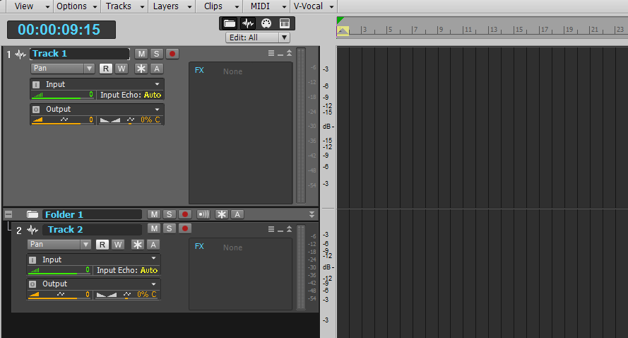 UnderTow
post edited by UnderTow - 2011/02/04 14:35:04
|
blakjustice30
Max Output Level: -89 dBFS

- Total Posts : 70
- Joined: 2010/01/08 18:06:36
- Location: Farmington Hills, MI.
- Status: offline
Re:X1 User interface looks cluttered!
2011/02/04 16:09:36
(permalink)
I love the way it looks now, it's more streamlined to me, cooler colors and it has a more transient look to it. I'm impressed. Now if I could just get sync my midi drums, I would be alright.
M~BLAK, Windows 7 64Bit /Multi Core/ 4 Gig Ram/1TB HD
Sonar X1 Studio
Protools LE
FL 10 Producer Edition Avalon 737 SP Compressor M-Audio Ultra 8 Presonus Digital Mixer M Audio Ultra 8 (Interface) Waves Diamond Bundle (and a host of midi controllers, synths and other outboard compressers and Mic preamps and )
|
trimph1
Max Output Level: -12 dBFS

- Total Posts : 6348
- Joined: 2010/09/07 19:20:06
- Location: London ON
- Status: offline
Re:X1 User interface looks cluttered!
2011/02/04 16:28:06
(permalink)
stickman393
Please stop. I'm going to start crying, for what we didn't get.
But seriously, I think it was a mistake to shrink the MSR,etc buttons that much. I think they are too small now.
Hear you on that one. With my eyesight the way it is it is a darn sight to see me almost bumping into the screen trying to find the dang things...I'm now thinking about getting a couple of 27" screens for this!!!
The space you have will always be exceeded in direct proportion to the amount of stuff you have...Thornton's Postulate. Bushpianos
|
karma1959
Max Output Level: -80 dBFS

- Total Posts : 515
- Joined: 2008/10/31 10:56:29
- Location: Brooklyn, NY
- Status: offline
Re:X1 User interface looks cluttered!
2011/02/12 17:29:11
(permalink)
Not sure how hard this would be from a coding perspective, however - variable font size for some items would be helpful - at least in the main transport up top - I'm running dual monitors at 1280*1024 (=2560*1024) and everything's so big! I've never struggled with screen real estate in previous versions.
To be fair, I haven't put much time into yet, so will refrain from negativity. Using screensets can likely solve the issue, however to me, the font sizes look very big and there's significant wasted space - which could possibly be used better both in the track and console views (console view in particular seems to have dead space all over, but then only a shortened / cryptic name for a plugin, etc.)
|
AT
Max Output Level: 0 dBFS

- Total Posts : 10654
- Joined: 2004/01/09 10:42:46
- Location: TeXaS
- Status: offline
Re:X1 User interface looks cluttered!
2013/12/04 00:13:04
(permalink)
This looks really good, UnderTow.
@
https://soundcloud.com/a-pleasure-dome
http://www.bnoir-film.com/ there came forth little children out of the city, and mocked him, and said unto him, Go up, thou bald head; go up, thou bald head. 24 And he turned back, and looked on them, and cursed them in the name of the Lord. And there came forth two she bears out of the wood, and tare forty and two children of them.
|
scook
Forum Host

- Total Posts : 24146
- Joined: 2005/07/27 13:43:57
- Location: TX
- Status: offline
Re:X1 User interface looks cluttered!
2013/12/04 00:21:06
(permalink)
looks the same as it did in 2011 when it was posted.
|
FCCfirstclass
Max Output Level: -71 dBFS

- Total Posts : 969
- Joined: 2003/11/15 15:02:42
- Location: Las Vegas, Nevada
- Status: offline
Re:X1 User interface looks cluttered!
2013/12/04 07:21:55
(permalink)
Win 10 Pro x64, 32Gb DDR3 ram, Sonar Platinum, Cubase 9.5, Mackie MCU Pro, Cakewalk VS 100, Roland Octa-Capture, A 800 Pro, Carver M-1.5t amp & C4000 pre amp, various mics, drums and brass instruments. And away we go!
|