24bit
Max Output Level: -90 dBFS

- Total Posts : 32
- Joined: 2005/02/16 03:17:02
- Status: offline
X1 User interface looks cluttered!
I think I'll pass on this one. The interface is a downgrade to me. It's not as easy on the eyes as the previous versions.
Change isn't always a good thing.
"My favorite language is music" --24bit
|
guitarmikeh
Max Output Level: -72 dBFS

- Total Posts : 942
- Joined: 2005/03/11 23:16:02
- Location: ?
- Status: offline

Re:X1 User interface looks cluttered!
2011/01/25 01:35:11
(permalink)
thanks for the update. enjoy.
I harbor no ill will towards any man.
|
Crush
Max Output Level: -88 dBFS

- Total Posts : 138
- Joined: 2011/01/19 15:57:29
- Status: offline
Re:X1 User interface looks cluttered!
2011/01/25 01:42:47
(permalink)
Really I thought it was just me.
I have a 1900 x 1200 28" monitor with another 22" as a second monitor and honest to goodness I feel it is very cluttered no matter what I do.
|
soundtweaker
Max Output Level: -70 dBFS

- Total Posts : 1036
- Joined: 2003/11/12 12:25:59
- Location: San Francisco
- Status: offline
Re:X1 User interface looks cluttered!
2011/01/25 02:16:56
(permalink)
You guys are both trippin balls.
|
Re:X1 User interface looks cluttered!
2011/01/25 02:22:04
(permalink)
I couldn't disagree more. 8.5 was massively cluttered with buttons and widgets everywhere. X1 is much more organized and sleek looking. Try hiding the Control Bar by pressing 'C' if you want to go for a really minimal look.
|
Middleman
Max Output Level: -31.5 dBFS

- Total Posts : 4397
- Joined: 2003/12/04 00:58:50
- Location: Orange County, CA
- Status: offline
Re:X1 User interface looks cluttered!
2011/01/25 02:27:21
(permalink)
X1 is awesome on a 27 inch monitor. Wouldn't change a thing.
|
allenheresy
Max Output Level: -90 dBFS
- Total Posts : 43
- Joined: 2011/01/25 04:05:34
- Status: offline
Re:X1 User interface looks cluttered!
2011/01/25 04:13:17
(permalink)
I want to take and rephrase what the OP said.
The interface is beautiful and clean, however it is not well managed or organized. In S8PE I have access to all the icons and tools I need, and the I dont feel cramped for workspace. In X1, I dont have any tools that I need and I am already running low on workspace. I really liked X1 for the day I had it installed... but it was not friendly for midi-work.
So, not cluttered, just bulky. If I could change anything on the program however, it would be to regain the functionality of 8PE with the beauty of X1. Just my $0.02.
|
himalaya
Max Output Level: -85 dBFS

- Total Posts : 282
- Joined: 2006/10/24 12:30:01
- Status: offline
Re:X1 User interface looks cluttered!
2011/01/25 06:41:54
(permalink)
Seth Perlstein [Cakewalk
]
I couldn't disagree more. 8.5 was massively cluttered with buttons and widgets everywhere. X1 is much more organized and sleek looking. Try hiding the Control Bar by pressing 'C' if you want to go for a really minimal look.
The mistake Cakewalk made with Sonar pre-X1 was to ship it with all those buttons showing by *default*. That's what had created the messy look. Another reason for the messy look was the way the buttons were arranged, creating a nebulous, 'busy' look. Yet another was the actual graphic design, ie: chunky 3D buttons with shadows. Personally, I have just a few buttons showing at the top bar in Sonar 8, and some essential ones at the bottom. No clutter what so ever, and the whole working area is very lean and streamlined. Likewise, with the track widgets, if Sonar (pre-X1) was shown in all promotion images showing just the MIX widgets, it would certainly have given a different feel to those who were interested in Sonar.
|
2re
Max Output Level: -89 dBFS

- Total Posts : 68
- Joined: 2006/01/17 23:54:17
- Location: Norway
- Status: offline
Re:X1 User interface looks cluttered!
2011/01/25 07:35:23
(permalink)
I think X1 looks much cleaner than previous versions of Sonar. I have the browser, inspector and control bar on my second monitor, and just a simple track view on my main monitor.
Though, I do wish some of the features that previously were accessible form the individual audio and MIDI tracks in track view, wasn't tucked away in X1's inspector.
SONAR Platinum | Windows 8 (x64) | i7-2600K @ 3.4GHz | Kingston DDR3 HyperX 1600MHz 16GB RAM | MSI P67A-GD65 B3 motherboard | Gainward GeForce GTS 450 1GB PhysX CUDA | RME HDSPe AIO | UAD-2 QUAD
|
chuckebaby
Max Output Level: 0 dBFS

- Total Posts : 13146
- Joined: 2011/01/04 14:55:28
- Status: offline
Re:X1 User interface looks cluttered!
2011/01/25 07:46:02
(permalink)
once you learn how to set up your control bar and you screen sets...if you dont like the overwhelming veiw..use your preferences and hide somethings..it does have that option..flexability is great with decludering the veiw
|
HumbleNoise
Max Output Level: -46 dBFS

- Total Posts : 2946
- Joined: 2004/01/04 12:53:50
- Status: offline
Re:X1 User interface looks cluttered!
2011/01/25 09:51:11
(permalink)
I think maybe in this case unfamiliarity breeds contempt. I was really confused when I first started working in X1. The smart tool was WAY smarter than me. The Control bar didn't have what I wanted in it. Multi dock was docking stuff in weird ways and the going was slow and pretty rough.
But I really dug in and after watching the free groove 3 videos and digging some more, learning the Screen Sets and digging some more I now find X1 to be WAY more functional than 8.5 ever was. But it took time and I can see where someon would expect there to be a pretty easy learning curve but it's not.
Worth it to learn the new interface? I think so but maybe it's not for you, but giving it a real chance it just may grow on you.
Humbly Yours Larry Sonar X2 x64 MAudio 2496 Yamaha MG 12/4 Roland XV-88 Intel MB with Q6600 and 4 GB Ram NVidia 9800 GTX Windows 7 x64 Home Premium
|
cornieleous
Max Output Level: -74 dBFS

- Total Posts : 809
- Joined: 2004/11/04 03:17:18
- Status: offline
Re:X1 User interface looks cluttered!
2011/01/25 09:59:33
(permalink)
So, not cluttered, just bulky. If I could change anything on the program however, it would be to regain the functionality of 8PE with the beauty of X1. Just my $0.02. Nicely put. I agree, and I wish the removal of tools from track headers and toolbars had been an option rather than a choice made for us - that would be the best of both.
|
Supercomposer
Max Output Level: -85 dBFS
- Total Posts : 259
- Joined: 2010/05/27 05:11:09
- Location: In a Lear-Jet above you
- Status: offline
Re:X1 User interface looks cluttered!
2011/01/25 10:51:44
(permalink)
well i had (and have) my gripes with X1 but the interface is certainly NOT cluttered, it´s well designed. I have 30 inch, but
Make it for the 19 inch monitors a little more customizable (offer "small" views for elements) and the guys which only have tiny ones will be happy .
ME is the Supercomposer, and all your base are belong to us (Yes, I mean Germany) System Spec: CPU 2x X7560 Xeon 16-Core, 48 GIG Ram Kingston, Intel with Supermicro Workstation MP Boards, RME HDSPe, PNY Quadro 6000
|
listen
Max Output Level: -79 dBFS

- Total Posts : 593
- Joined: 2008/09/12 06:07:55
- Status: offline
Re:X1 User interface looks cluttered!
2011/01/25 11:00:22
(permalink)
Change is difficult - Moreover; change is inevitable...
The more familiar you become with it the more your going to like it...
- Listen - FOH Mixer & Recording Studio Manager Nothing but the grace of God - mggtg. VS 700C - R / CONSOLE 1 / NEVE PORTICO 5017 / TASCAM UH-7000 / SONAR PLATINUM / REASON RECORD 9 / VMP 2 / UREI 7110's / UA LA-610 MkII / AUDIENT ASP 880 / CREATION STATION 450 V 5 WINDOWS 10 / HOME 64 - BIT / SKYLAKE CORE i7 (i7 - 6700, 4 CORES/8 THREADS)
|
SteveStrummerUK
Max Output Level: 0 dBFS
- Total Posts : 31112
- Joined: 2006/10/28 10:53:48
- Location: Worcester, England.
- Status: offline
Re:X1 User interface looks cluttered!
2011/01/25 11:01:37
(permalink)
I wish I had a big one 
|
twisted6s
Max Output Level: -55 dBFS

- Total Posts : 2001
- Joined: 2007/08/21 21:10:33
- Location: New York
- Status: offline
Re:X1 User interface looks cluttered!
2011/01/25 11:07:54
(permalink)
I got 3 words for you newbie: Multi-Dock!!!!..... oh, wait...
|
neiby
Max Output Level: -75 dBFS

- Total Posts : 765
- Joined: 2007/06/19 14:34:54
- Status: offline
Re:X1 User interface looks cluttered!
2011/01/25 11:23:19
(permalink)
soundtweaker
You guys are both trippin balls.
I agree. I think we're being trolled. :) The X1 interface is decidedly less cluttered than 8.5, especially on a large monitor. However, perhaps we just have different definitions of the word "cluttered". To me, it's a lot less cluttered and easy on the eyes than 8.5 was. EDIT: I want to be clear that I was joking about being trolled. :) I realize that people like what they like and everyone has different preferences.
post edited by neiby - 2011/01/25 11:26:41
|
chuckebaby
Max Output Level: 0 dBFS
- Total Posts : 13146
- Joined: 2011/01/04 14:55:28
- Status: offline
Re:X1 User interface looks cluttered!
2011/01/25 15:17:54
(permalink)
im fairly new but am wondering..have the trolls always been here or are they just coming out now cause of x1's release?..
cause ive read some really good ones..one guys was complaing about something untill another member solved his problem...then he was like.."o yea,well what about the bugs?...i mean really?
|
HumbleNoise
Max Output Level: -46 dBFS
- Total Posts : 2946
- Joined: 2004/01/04 12:53:50
- Status: offline
Re:X1 User interface looks cluttered!
2011/01/25 15:20:31
(permalink)
chucke, I'm discovering this forum is infested with human nature, and that ain't gonna change any time soon. 
Humbly Yours Larry Sonar X2 x64 MAudio 2496 Yamaha MG 12/4 Roland XV-88 Intel MB with Q6600 and 4 GB Ram NVidia 9800 GTX Windows 7 x64 Home Premium
|
bapu
Max Output Level: 0 dBFS

- Total Posts : 86000
- Joined: 2006/11/25 21:23:28
- Location: Thousand Oaks, CA
- Status: offline
Re:X1 User interface looks cluttered!
2011/01/25 15:25:14
(permalink)
chuckebaby
im fairly new but am wondering..have the trolls always been here or are they just coming out now cause of x1's release?..
cause ive read some really good ones..one guys was complaing about something untill another member solved his problem...then he was like.."o yea,well what about the bugs?...i mean really?
Pay no attention to Bapu posters like that.
|
Kroneborge
Max Output Level: -65 dBFS

- Total Posts : 1300
- Joined: 2011/01/18 22:14:58
- Location: Lompoc CA (near Santa Barbara)
- Status: offline
Re:X1 User interface looks cluttered!
2011/01/25 15:25:18
(permalink)
doesn't really feel cluttered IMO, does feel less customizable, and hard to find things.
Also seems like the buttons are bigger and take up more space.
|
BEATZM1D10T
Max Output Level: -85 dBFS
- Total Posts : 285
- Joined: 2009/05/22 12:43:50
- Location: Mid-West
- Status: offline
Re:X1 User interface looks cluttered!
2011/01/25 15:26:25
(permalink)
HumbleNoise
chucke,
I'm discovering this forum is infested with human nature, and that ain't gonna change any time soon.
That or plants....not your garden variety.
|
bapu
Max Output Level: 0 dBFS
- Total Posts : 86000
- Joined: 2006/11/25 21:23:28
- Location: Thousand Oaks, CA
- Status: offline
Re:X1 User interface looks cluttered!
2011/01/25 15:26:33
(permalink)
Kroneborge
Also seems like the buttons are bigger and take up more space.
Maybe another definition for cluttered?
|
neiby
Max Output Level: -75 dBFS
- Total Posts : 765
- Joined: 2007/06/19 14:34:54
- Status: offline
Re:X1 User interface looks cluttered!
2011/01/25 15:28:44
(permalink)
bapu
Kroneborge
Also seems like the buttons are bigger and take up more space.
Maybe another definition for cluttered?
That's a point I was making earlier. Perhaps we different ideas of what cluttered even means. I think a whole bunch of small buttons looks horribly cluttered. I'd rather have fewer buttons that are larger and more prominent. To me, that is less cluttered and has a cleaner feel to it.
|
Dave Modisette
Max Output Level: 0 dBFS
- Total Posts : 11050
- Joined: 2003/11/13 22:12:55
- Location: Brandon, Florida
- Status: offline
Re:X1 User interface looks cluttered!
2011/01/25 15:32:32
(permalink)
Also seems like the buttons are bigger I think I asked for that one, so blame me. Now, I'm asking for no dark gray text on black backgrounds. 
|
bapu
Max Output Level: 0 dBFS
- Total Posts : 86000
- Joined: 2006/11/25 21:23:28
- Location: Thousand Oaks, CA
- Status: offline
Re:X1 User interface looks cluttered!
2011/01/25 15:33:50
(permalink)
Mod Bod
Also seems like the buttons are bigger
I think I asked for that one, so blame me. Now, I'm asking for no dark gray text on black backgrounds.
And when that happens, I'll blame you.
|
Mesh
Max Output Level: 0 dBFS
- Total Posts : 27360
- Joined: 2009/11/27 14:08:08
- Location: Online right here!
- Status: offline
Re:X1 User interface looks cluttered!
2011/01/25 15:46:46
(permalink)
neiby
I think a whole bunch of small buttons looks horribly cluttered. Possibly ordered the wrong version of X1?? 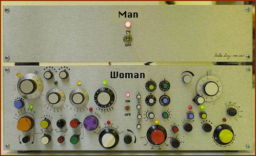
Platinum Gaming DAW: AsRock Z77 Overclock FormulaI7 3770k @ 4.5GHz : 16GB RAM G.Skill Ripjaws X 250GB OS SSD : 3TB HDD : 1TB Sample HDDWin 10 Pro x 64 : NH-D14 CPU Cooler HIS IceQ 2GB HD 7870Focusrite Scarlett 2i4The_Forum_Monkeys
|
Mooch4056
Max Output Level: -0.5 dBFS

- Total Posts : 7494
- Joined: 2005/02/19 17:40:35
- Location: Chicago
- Status: offline
Re:X1 User interface looks cluttered!
2011/01/25 16:06:59
(permalink)
bapu
Kroneborge
Also seems like the buttons are bigger and take up more space.
Maybe another definition for cluttered?
youre the one who IS the definition cluttered BAPU!!! 
From Now On Call Me Conquistador!
Donate to the cure Bapu Foundation Email: mooch4056@gmail.com for more info
|
cornieleous
Max Output Level: -74 dBFS
- Total Posts : 809
- Joined: 2004/11/04 03:17:18
- Status: offline
Re:X1 User interface looks cluttered!
2011/01/25 16:19:30
(permalink)
listen
Change is difficult - Moreover; change is inevitable...
The more familiar you become with it the more your going to like it...
I find this to be quite a popular assumption - but not necessarily an accurate one. If the change is good, then sure I will like it, and if not, then not. In the case of X1, there are changes in each category. I still think the revision knife cut too deep and removed some powerful options.
|
The Maillard Reaction
Max Output Level: 0 dBFS
- Total Posts : 31918
- Joined: 2004/07/09 20:02:20
- Status: offline
.
post edited by Splat Chat O'samplemashy - 2018/12/21 17:17:48
|