nighthadfallen
Max Output Level: -88 dBFS

- Total Posts : 118
- Joined: 2004/04/11 16:31:49
- Location: Burnt Hills NY
- Status: offline

Re:X1 User interface looks cluttered!
2011/01/28 17:32:56
(permalink)
No, I'm not joking. The paintings aren't showing you how to build a house or kill a goat. It's like telling me one of the songs you've composed has a functional purpose. Maybe if you wrote one on how to eq a vocal track. I wonder if that would be the most effective means by which to achieve that end? In any event, your pseudo-intellectual/quasi cultural/historical finesse won't quite achieve it's desired effect with me. Thanks. mike_mccue
nighthadfallen
I don't think that comparison works Mike. The paintings are purely aesthetic and serve no functional purpose.
Your joking right?
What do you think paintings were in an age before television, radio, and mass distribution of books?
best regards,
mike
"I like to eat at McDonald's because of the food they sell." Lenovo Laptop / Win 7 64 / Core i7 1.60ghz / 4gb RAM / Roland UA-25ex Win 7 32 Desktop / Q8300 2.5ghz / 4gb RAM / Echo Mia Midi
|
Glennbo 
Max Output Level: -57 dBFS

- Total Posts : 1840
- Joined: 2003/11/10 22:38:37
- Location: Planet Earth
- Status: offline
Re:X1 User interface looks cluttered!
2011/01/28 17:35:51
(permalink)
SteveStrummerUK
Glennbo
Too many knobs and buttons doesn't look professional!!! <g>
Wow 
You've been in CJ's studio 
Nah, that's *MY* old studio, before I spent the BIG bucks! <GGG> Disclaimer: That's NOT really my old studio, but the presence of many knobs and buttons is what I expect in a professional studio!
|
Jonbouy
Max Output Level: 0 dBFS

- Total Posts : 22562
- Joined: 2008/04/14 13:47:39
- Location: England's Sunshine South Coast
- Status: offline
Re:X1 User interface looks cluttered!
2011/01/28 17:36:27
(permalink)
"We can't do anything to change the world until capitalism crumbles. In the meantime we should all go shopping to console ourselves" - Banksy
|
Lynn
Max Output Level: -14 dBFS

- Total Posts : 6117
- Joined: 2003/11/12 18:36:16
- Location: Kansas City, MO
- Status: offline
Re:X1 User interface looks cluttered!
2011/01/28 17:38:14
(permalink)
A thought for X1c or d, make it possible for each user to design their own interface with the ability to shrink or maximize whatever widget or icon they want. Or, offer several defaults instead of one. Or, or, or...no graphics, just text ;) Or visa versa.
|
The Maillard Reaction
Max Output Level: 0 dBFS
- Total Posts : 31918
- Joined: 2004/07/09 20:02:20
- Status: offline
.
post edited by Splat Chat O'samplemashy - 2018/12/21 17:27:15
|
SteveStrummerUK
Max Output Level: 0 dBFS
- Total Posts : 31112
- Joined: 2006/10/28 10:53:48
- Location: Worcester, England.
- Status: offline
Re:X1 User interface looks cluttered!
2011/01/28 17:40:40
(permalink)
Glennbo
SteveStrummerUK
Glennbo
Too many knobs and buttons doesn't look professional!!! <g>
Wow
You've been in CJ's studio
Nah, that's *MY* old studio, before I spent the BIG bucks! <GGG>
Disclaimer: That's NOT really my old studio, but the presence of many knobs and buttons is what I expect in a professional studio!

|
Brandon Ryan [Roland]
Max Output Level: -40.5 dBFS

- Total Posts : 3458
- Joined: 2003/11/06 03:29:12
- Location: Los Angeles, CA
- Status: offline
Re:X1 User interface looks cluttered!
2011/01/28 17:42:07
(permalink)
mike_mccue
Brandon,
This is not your finest moment.
When you tell a customer that has sent the Corporation you work for $2580 that he is nit picky... well it's just not an ideal situation.
Mike, I have to apologize if it came off that way. I meant to make the careful (albeit slippery perhaps) distinction between "acting in a nit-picky way" and " being a nit-picky person, or a nitpicker - if you will. I sincerely meant the former. In my mind it is less than offensive, but either way, please understand that your support over the years is indeed held in high regard and I meant in no way to insult the character of your "whole person". I know I get sometimes what many could consider overly nit-picky (or "particular" if you like) at times and about certain things, but at my core I'd like to think I'm a relatively adaptable if not even happy-go-lucky person. I know you have a hard job... keep up the good work... I admire your professional work ethic... and appreciate that you want to share your thoughts.
I really do appreciate that. The use of negative space in 2d design is VERY effective when the role of the design is to make 1, 2 or very few points in a communications endeavor. That has been proven in 3000 years of 2D design. The Egyptians and Assyrians figured it out.
The fact is that SONAR's GUI is not a simple display of a few prominent ideas.
The ads that Cakewalk is running in the Magazines are, and they are nice. They highlight the Cakewalk and SONAR logo and bring the brand to top of mind... that design and it's use of negative space is contextual to its role as an advertisement.
SONAR's gui is nothing like an advertisement or a page from a coffee table book.
SONAR's GUI is a control surface.
I understand the distinction you are making but I would argue that even with those distinctions, certain aesthetic principles are still applicable. SONAR is interactively presenting information. And the fact is that not everyone wants to be confronted with every option all the time. I understand you are a person who feels very comfortable with a lot of stuff around them...the more switches and dials and meters and lights the better. I'm probably even more like that than a lot of poeple. But some people, especially creative people, respond very negatively to that. And we hear from those poeple too. They are, perhaps subsequently, also less likely the kinds to come on a forum and debate UI design point by point. Imagine that you have a 64 channel SSL console and overnight someone takes off several of the knobs? Is that a good idea or is that foolish?
I guess it depends. Is it the same version or has someone brought me a new, redesigned 64-channel SSL? If they chose to redesign and move - or remove - some things I would keep an open mind probably. This brings me to the term "foolish". Brandon, I prefer positive reinforcement, and I take every opportunity to provide some when it is applicable.
I know you do Mike - and it doesn't go unnoticed. In this situation, where Cakewalk has reduced the immediate functionality of the track view I think that Cakewalk itself should have exercised the ability to self correct the choices before it ever became an issue for the end user. I feel it was foolish for Cakewalk as a corporation to not self correct the decision to reduce functionality.
OK...like I said if you really think it was foolish (as in acting in a foolish way or something brought on by actual fools) then by all means stick to it. IMO, the functionality in question was not really reduced all that much when applied to most people's workflow habits. But I do understand the exceptions as I've stated. Previously, if any one wanted to view fewer tracks, and more wasted space, in track view they had every option to expand the tracks to do so. This was 100% optional with the effect of causing track view to visually appear as less "cluttered".
Yeah but options can be oppressive. And when someone is confronted with every option up front and then told, well you can go tweak this and that to make it more inviting and usable for you, they turn off. In X1, if I want to view as many tracks with as much functionality as I have previously experienced... I simply can not do that.
And we should strive to allow you to do just that within the new framework. I wouldn't deny you that. I have no option but to tolerate the fact that Cakewalk made a decision to reduce the functionality of the track view.
Perhaps.  I expect myself to be capable of self analysis and make use of logic and experience to make good decisions.
I feel that Cakewalk, a corporation with numerous skilled and talented employees should be able to provide the results of self corrective behavior with as much rigor as I expect of myself.
The decision to reduce functionality in an arbitrary way is not a good decision and this should have been obvious within Cakewalk and it should have been anticipated that an end user might observe that reduced functionality is simply reduced functionality.
I can not make a positive comment about this, and it seems that negative reinforcement is the only available option.
A strong individual or Corporation can take negative reinforcement, either self realized or delivered from afar, and make the very best with it. This has been demonstrated since the origin of our human species and human societies. It is a test of character and strength.
Cakewalk can provide all the previous functionality with the option to hide anything any user wants to hide and Cakewalk can make any feature available, redundantly, within the inspector to any user who prefers that. Those are two decidedly non-foolish ideas.
The fact that Cakewalk choose to present a lack of functionality as a positive improvement and then offer illogical justification, arbitrary opinion, and dare I say, excuse making to support the decision to reduce the functionality in track view suggests to me that Cakewalk is not capable of providing fully realized self evaluation.
The only way to improve functionality is too restore the track count in track view, at any given choice of custom display/hide layout, to its former capability and perhaps enhance the abilities of track view by improving how the previously required amount of space was utilized.
Removing functionality and reducing the number of tracks that can viewed in track view is indeed a loss of functionality and the fact that Cakewalk can not accept that fact requires that someone point out that there is a lack of logic and an inability to self correct decisions that result in loss of functionality.
I admire how very hard you work with your efforts to represent Cakewalk.
I dislike offering negative reinforcement, but it is often times effective when all other options have proven to be ineffective.
I have repeatedly sent in my yearly upgrade fee because that is the only way to remain in the patch road map.
Cakewalk has repeatedly provided me with less than was advertised, and routinely advised me to anticipate a patch. Cakewalk has never made it past 3rd base in the 13 versions that I have purchased.
I honestly do not feel that Cakewalk will improve its track record with me as an end users until it acknowledges it's own inability to consider the facts as they stand and provide solid decision making and critical self evaluation where logic and facts are prioritized over all other considerations.
While I don't necessarily agree with all the characterizations, your feelings are yours and in that sense they are valid and, for what it's worth, most assuredly taken to heart. I certainly won't make any quarrel with that. If I was working in the Cakewalk organization I would have provided the illustration I posted above at the earliest opportunity and made it absolutely clear to everyone on the committee that it is not nit picking to resist the removal of existing functionality from SONAR. I am a guy the boss often finds both irritating and invaluable... because I push for a universal truth and frequent rigorous self evaluation.
Ah sometimes I wish you could see the whole picture Mike. All I can say is that things often look simpler and more black and white from the outside looking in. I anticipate that several posters will ask inane questions about track count loss... this has been discussed in great detail in other threads and I am disappointed to realize that some forum members are simply in denial about the facts as they stand.
I hope not. But if so I think it's just that some poeple don't value the need to see a boat-load of tracks at once. At any given level of functionality, the number of tracks that may be viewed simultaneously in previous versions of track view has been reduced in the X1 version of SONAR.
To a degree of course, this is true. Brandon, Good luck with the next few years of SONAR recuperation... I hope you will allow me to continue the journey with you. You are a great asset to Cakewalk and I am sure the corporation is aware that you are very good at what you do.
Thanks Mike - i appreciate that. And please stay aboard as long as you like. Hopefully we're going in the general direction you'd like to journey. all the very best,
mike
post edited by Brandon Ryan [Cakewalk] - 2011/01/28 17:47:25
"The sky above the port was the color of television, tuned to a dead channel." WG SONAR Platinum | VS-700 | A-800 PRO | PCAL i7 with SSD running Windows 8 x64 | Samsung 27" LCD @ 1920x1080 | Blue Sky monitors with BMC | All kinds of other stuff
|
The Maillard Reaction
Max Output Level: 0 dBFS
- Total Posts : 31918
- Joined: 2004/07/09 20:02:20
- Status: offline
.
post edited by Splat Chat O'samplemashy - 2018/12/21 17:27:30
|
Brandon Ryan [Roland]
Max Output Level: -40.5 dBFS
- Total Posts : 3458
- Joined: 2003/11/06 03:29:12
- Location: Los Angeles, CA
- Status: offline
Re:X1 User interface looks cluttered!
2011/01/28 17:49:07
(permalink)
mike_mccue
nighthadfallen
I don't think that comparison works Mike. The paintings are purely aesthetic and serve no functional purpose.
Your joking right?
What do you think paintings were in an age before television, radio, and mass distribution of books?
best regards,
mike
This is a pretty, shall we say, esoteric argument I think Mike.
"The sky above the port was the color of television, tuned to a dead channel." WG SONAR Platinum | VS-700 | A-800 PRO | PCAL i7 with SSD running Windows 8 x64 | Samsung 27" LCD @ 1920x1080 | Blue Sky monitors with BMC | All kinds of other stuff
|
nighthadfallen
Max Output Level: -88 dBFS
- Total Posts : 118
- Joined: 2004/04/11 16:31:49
- Location: Burnt Hills NY
- Status: offline
Re:X1 User interface looks cluttered!
2011/01/28 17:49:20
(permalink)
In any event, your pseudo-intellectual/quasi cultural/historical finesse won't quite achieve it's desired effect with me. Thanks.
While apologies/clarifications are being handed out, I may as well do one of my own. Sorry Mike, that was below the belt. I think you are a true intellectual and I enjoy your thoughts.
"I like to eat at McDonald's because of the food they sell." Lenovo Laptop / Win 7 64 / Core i7 1.60ghz / 4gb RAM / Roland UA-25ex Win 7 32 Desktop / Q8300 2.5ghz / 4gb RAM / Echo Mia Midi
|
Brandon Ryan [Roland]
Max Output Level: -40.5 dBFS
- Total Posts : 3458
- Joined: 2003/11/06 03:29:12
- Location: Los Angeles, CA
- Status: offline
Re:X1 User interface looks cluttered!
2011/01/28 17:49:57
(permalink)
mike_mccue
Thanks for the detailed reply Brandon.
I hope some of these thoughts will resonate and perhaps resurface at some future, in house Cakewalk planning meeting.
All the best,
mike
It was my pleasure and you can always be certain it's not on "deaf ears".
"The sky above the port was the color of television, tuned to a dead channel." WG SONAR Platinum | VS-700 | A-800 PRO | PCAL i7 with SSD running Windows 8 x64 | Samsung 27" LCD @ 1920x1080 | Blue Sky monitors with BMC | All kinds of other stuff
|
The Maillard Reaction
Max Output Level: 0 dBFS
- Total Posts : 31918
- Joined: 2004/07/09 20:02:20
- Status: offline
.
post edited by Splat Chat O'samplemashy - 2018/12/21 17:27:42
|
SteveStrummerUK
Max Output Level: 0 dBFS
- Total Posts : 31112
- Joined: 2006/10/28 10:53:48
- Location: Worcester, England.
- Status: offline
Re:X1 User interface looks cluttered!
2011/01/28 18:11:02
(permalink)
|
UnderTow
Max Output Level: -37 dBFS

- Total Posts : 3848
- Joined: 2004/01/06 12:13:49
- Status: offline
Re:X1 User interface looks cluttered!
2011/01/28 20:32:51
(permalink)
Another design with slightly more compact I/O thingies.  UnderTow
|
Rothchild
Max Output Level: -61 dBFS

- Total Posts : 1479
- Joined: 2003/11/27 13:15:24
- Status: offline
Re:X1 User interface looks cluttered!
2011/01/29 03:55:50
(permalink)
ProjectM
UnderTow
Brandon, I haven't opened the Console View in Sonar for over a decade (For actual work that is. I have looked at it from time to time out of curiosity). I find this suggestion reveals that those widgets really need to be returned. Anything that forces one to open a view that one never uses can not be an improvement. DAW 2.0 remember, we don't need no stinking Console View in 2011!
What??? I'm mean: Whaaaat???? Are you serious? I really hope that this is just a joke. I'm referring to the bold quote....
I'm not advocating the removal of console view, but I entirely endorse Undertow's view here. (And you can include the vertical channel inspector strip in that as well, pointless visual clutter imo). Currently Sonar (XL through 8.5) is the only DAW on the market that doesn't oblige the user to use some arcane mixer metaphor in order to get their work done. Undertow, the mock ups are developing well, I think the need to change the colours of the controls becomes quite important when you remove the 'Gain' 'Volume' text from them, as it's difficult sometimes to see the difference between the the broken and solid triangle icon that differentiates them. Child
|
himalaya
Max Output Level: -85 dBFS

- Total Posts : 282
- Joined: 2006/10/24 12:30:01
- Status: offline
Re:X1 User interface looks cluttered!
2011/01/29 06:59:58
(permalink)
UnderTow
Another design with slightly more compact I/O thingies.
UnderTow
I like your mock up much better than the official X1 design. Just having a quick glance at your version, I can see the vol, pan, input, output sections much more clearly. A better asthetic all round. I like the little graphic representations for pan/vol taken from Sonar 8 better as well. Shame X1 doesn't have re-skinning abilities like Reaper, as I know who I would be hassling for a new skin. (and these are such minor tweaks, yet make so much difference for me).
post edited by himalaya - 2011/01/29 07:01:23
|
stevec
Max Output Level: 0 dBFS
- Total Posts : 11546
- Joined: 2003/11/04 15:05:54
- Location: Parkesburg, PA
- Status: offline
Re:X1 User interface looks cluttered!
2011/01/29 12:04:40
(permalink)
Now that I've had about two weeks to get used to X1, I feel like I'm about ready to start contributing to these threads. I will say though, it's been an interesting experience doing nothing but reading the many posts... ;)
Anyhow... I thought this thread was a good place to start since I really like the way it's progressed. I also think UT has something good going with his proposed redesign. Particularly since the Input and Output widgets do not look the Edit Filter widget - which in my mind should look somewhat unique given what it does.
However, what I personally don't like is the "icons" for Gain and Volume. Then again, I've never really cared for those (and Pan) in any previous version. What I'd personally like to see is the words Input and Output in light grey, and the words Gain and Volume in white. IOW, more focus on Gain and Volume which are the controls I use waaay more often than Input and Output. So in effect it would be something like:
Input
Gain
Output
Volume Pan
$.03
SteveC
SteveC https://soundcloud.com/steve-cocchi http://www.soundclick.com/bands/pagemusic.cfm?bandID=39163 SONAR Platinum x64, Intel Q9300 (2.5Ghz), Asus P5N-D, Win7 x64 SP1, 8GB RAM, 1TB internal + ESATA + USB Backup HDDs, ATI Radeon HD5450 1GB RAM + dual ViewSonic VA2431wm Monitors; Focusrite 18i6 (ASIO); Komplete 9, Melodyne Studio 4, Ozone 7 Advanced, Rapture Pro, GPO5, Valhalla Plate, MJUC comp, MDynamic EQ, lots of other freebie VST plugins, synths and Kontakt libraries
|
ProjectM
Max Output Level: -36 dBFS

- Total Posts : 3941
- Joined: 2004/02/10 09:32:12
- Location: Norway
- Status: offline
Re:X1 User interface looks cluttered!
2011/01/29 12:41:58
(permalink)
Rothchild
ProjectM
UnderTow
Brandon, I haven't opened the Console View in Sonar for over a decade (For actual work that is. I have looked at it from time to time out of curiosity). I find this suggestion reveals that those widgets really need to be returned. Anything that forces one to open a view that one never uses can not be an improvement. DAW 2.0 remember, we don't need no stinking Console View in 2011!
What??? I'm mean: Whaaaat???? Are you serious? I really hope that this is just a joke. I'm referring to the bold quote....
I'm not advocating the removal of console view, but I entirely endorse Undertow's view here. (And you can include the vertical channel inspector strip in that as well, pointless visual clutter imo).
Currently Sonar (XL through 8.5) is the only DAW on the market that doesn't oblige the user to use some arcane mixer metaphor in order to get their work done.
Child
Well if Cakewalk removed the Console View I'd be on the first plane to Boston to demonstrate my dislike out side their offices with posters and a megaphone before e-mailing them a dead rat. I'm exaggerating of course... I seriously have no problems with yours or UnderTows choice not to use the CV or the Channel Inspector bit for my self - and most people I know - the Console View (or mixer or whatever they call it in their DAWs) is a very important piece of the software. Now, if you like to ignore it, that's fine. And you can. If every one else want to use it that's fine. But stating that "We don't need a Console View in 2011" is plain and simply a stupid thing to say (if serious) and I will refer to a point that's been made here on the forums many times lately: Don't post your opinions as fact! (This is not directed to your response Rothchild)
(Sonar Platinum - Win10 x64) - iMac and 13" MacBook - Logic Pro X ++ - UA Apollo Twin DUO - NI Maschine MKII - NI Komplete Kontrol S61 - Novation Nocturne - KRK Rokit 6 SoundcloudNegative Vibe Records
|
brundlefly
Max Output Level: 0 dBFS
- Total Posts : 14250
- Joined: 2007/09/14 14:57:59
- Location: Manitou Spgs, Colorado
- Status: offline
Re:X1 User interface looks cluttered!
2011/01/29 12:46:53
(permalink)
I says dump the Volume, Pan and Gain (Vel+) labels altogther. Previous versions did not have them, and I never had trouble distinguishing them, or knowing that Volume was output, and Gain was input. They're just taking up space, albeit that space was pretty much unused in previous versions. But the widgets did have to grow some to make room for readable labels - another contributor to the inability to fit as much info into the same header space in X1 as you could in 8.5.
|
stickman393
Max Output Level: -60 dBFS

- Total Posts : 1528
- Joined: 2003/11/07 18:35:26
- Status: offline
Re:X1 User interface looks cluttered!
2011/01/29 15:05:57
(permalink)
UnderTow
Another design with slightly more compact I/O thingies.
UnderTow
Nice. Very nice. I want that. Especially with the vol coloured orange and the trim/gain green. And I would be able to read the input/output text labels. I so want this.
|
John
Forum Host

- Total Posts : 30467
- Joined: 2003/11/06 11:53:17
- Status: offline
Re:X1 User interface looks cluttered!
2011/01/29 15:31:40
(permalink)
See beauty is in the eye of the beholder. I like the look of track 2. I do not care for track 1's look. Track 2 is the normal look of a track in X1. One can say there is no accounting for taste. I posted in my review of X1 that it would be nice if the track header could have all the widgets the user wants via the track control, that would be a good idea. 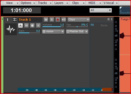 None the less, X1 looks good as is to me. As to not having a CV in Sonar I can't for the life of me figure out why that would be a good idea. One can use it or not but to say there is no point in having it makes no sense to me. One thing those that advocate this notion forget about is the many users using Sonar like me have a CS that is ideally set up for a CV type view. It makes sense for those that have a single monitor and no CS to not use the CV but those of us that do see the value in having a proper CV. X1 does need tweaking of how its various views look and the GUI of them but at present X1 is not the awful GUI as some seem so bent on saying.
|
UnderTow
Max Output Level: -37 dBFS
- Total Posts : 3848
- Joined: 2004/01/06 12:13:49
- Status: offline
Re:X1 User interface looks cluttered!
2011/01/29 16:25:54
(permalink)
ProjectM
I seriously have no problems with yours or UnderTows choice not to use the CV or the Channel Inspector bit for my self - and most people I know - the Console View (or mixer or whatever they call it in their DAWs) is a very important piece of the software. Now, if you like to ignore it, that's fine. And you can. If every one else want to use it that's fine. But stating that "We don't need a Console View in 2011" is plain and simply a stupid thing to say (if serious) and I will refer to a point that's been made here on the forums many times lately:
Don't post your opinions as fact!
Did you miss the ? Just in case, here is another one: Undertow
|
Rothchild
Max Output Level: -61 dBFS
- Total Posts : 1479
- Joined: 2003/11/27 13:15:24
- Status: offline
Re:X1 User interface looks cluttered!
2011/01/29 16:57:21
(permalink)
ProjectM, thanks for taking that with the pinch of salt it was intended with.
I'm quite aware that I'm in a minority with my belief / understanding that switching between vertical and horizontal is pointless brain gymnastics. (as evidenced by the fact that there are now no DAWs whatsoever that do not require you to do so).
It'd be fine if the default X1 presented, what appears to be the majority preference, no useful tools (reach for that salt seller again!). But at least give us the option to add them back.
I'm quite happy to root around for a little while and tweak my setup to suit my needs (and with an application as deep and various in it's possible uses as Sonar even Cake acknowledge that those needs and uses are broad a,nd often even contradictory). I'm not asking for the Reaper level of geekery whereby I have to design my own knobs and faders, but I do value being able to pick and choose what appears where and in which order.
John, you're great, but you appear to be continuing to ignore the fact that this debate is a little more nuanced than simply 'beauty' (which is certainly in the eye of the beholder) and more about 'Egonomics' (the confluence of aesthetics and usability). Just because you tend to find that whatever Cake give you is 'good enough' for you doesn't preclude that there are other use cases where it is not. A little more sympathy for those of us who are not as flexibly minded as you appear to be would be graciously received.
Child
|
UnderTow
Max Output Level: -37 dBFS
- Total Posts : 3848
- Joined: 2004/01/06 12:13:49
- Status: offline
Re:X1 User interface looks cluttered!
2011/01/29 17:13:58
(permalink)
brundlefly
I says dump the Volume, Pan and Gain (Vel+) labels altogther. Previous versions did not have them, and I never had trouble distinguishing them, or knowing that Volume was output, and Gain was input.
Could you clarify, do you mean the text labels or the little triangular icons? UnderTow
|
UnderTow
Max Output Level: -37 dBFS
- Total Posts : 3848
- Joined: 2004/01/06 12:13:49
- Status: offline
Re:X1 User interface looks cluttered!
2011/01/29 17:18:57
(permalink)
stickman393
Nice. Very nice. I want that. Especially with the vol coloured orange and the trim/gain green. And I would be able to read the input/output text labels. I so want this.
Thanks. Yes, different colours could make things even more obvious. I'll experiment a bit. UnderTow
|
Dave Modisette
Max Output Level: 0 dBFS
- Total Posts : 11050
- Joined: 2003/11/13 22:12:55
- Location: Brandon, Florida
- Status: offline
Re:X1 User interface looks cluttered!
2011/01/29 17:41:47
(permalink)
I use the Track Control feature as well as custom icons to declutter X1 to the max.  I can change screensets and show different widgets though I would prefer to be able to keybind the Track Control presets instead. EDIT: I just stumble over the Shift + Left/Right Arrow which will toggle through my Track Control Presets. Learning all of these short cut keys is a job in itself.  The only issue that I still have is the confounded FX bin and it's pinning to the right hand side of the Track Pane. If it would move left when all other widgets were hidden, it would be a thing of beauty instead of a blank space. I don't need some of the widgets to click on (like MSR) because I have an Alphatack and I can use it's buttons for that.
post edited by Mod Bod - 2011/01/29 17:49:54
|
John
Forum Host
- Total Posts : 30467
- Joined: 2003/11/06 11:53:17
- Status: offline
Re:X1 User interface looks cluttered!
2011/01/29 18:02:23
(permalink)
The only issue that I still have is the confounded FX bin and it's pinning to the right hand side of the Track Pane. If it would move left when all other widgets were hidden, it would be a thing of beauty instead of a blank space. No two ways about it the FX bin needs some work. As it is its nearly unusable.
|
brundlefly
Max Output Level: 0 dBFS
- Total Posts : 14250
- Joined: 2007/09/14 14:57:59
- Location: Manitou Spgs, Colorado
- Status: offline
Re:X1 User interface looks cluttered!
2011/01/30 03:02:09
(permalink)
UnderTow
brundlefly
I says dump the Volume, Pan and Gain (Vel+) labels altogther. Previous versions did not have them, and I never had trouble distinguishing them, or knowing that Volume was output, and Gain was input.
Could you clarify, do you mean the text labels or the little triangular icons?
UnderTow
Yes. I meant the text labels that say Volume, Pan and Gain.
|
Rothchild
Max Output Level: -61 dBFS
- Total Posts : 1479
- Joined: 2003/11/27 13:15:24
- Status: offline
Re:X1 User interface looks cluttered!
2011/01/30 04:03:59
(permalink)
UnderTow
stickman393
Nice. Very nice. I want that. Especially with the vol coloured orange and the trim/gain green. And I would be able to read the input/output text labels. I so want this.
Thanks. Yes, different colours could make things even more obvious. I'll experiment a bit.
UnderTow
Looking forward to seeing this version, my preference is for green gain, orange pan and blue volume but as long as they are all different it doesn't actually matter too much as it's re-learnable. I am relatively indifferent about whether they have text or an icon, but it should be one or the other (rather than both). Child
|
ProjectM
Max Output Level: -36 dBFS
- Total Posts : 3941
- Joined: 2004/02/10 09:32:12
- Location: Norway
- Status: offline
Re:X1 User interface looks cluttered!
2011/01/30 11:23:56
(permalink)
UnderTow
ProjectM
I seriously have no problems with yours or UnderTows choice not to use the CV or the Channel Inspector bit for my self - and most people I know - the Console View (or mixer or whatever they call it in their DAWs) is a very important piece of the software. Now, if you like to ignore it, that's fine. And you can. If every one else want to use it that's fine. But stating that "We don't need a Console View in 2011" is plain and simply a stupid thing to say (if serious) and I will refer to a point that's been made here on the forums many times lately:
Don't post your opinions as fact!
Did you miss the ? Just in case, here is another one:
Undertow
I was hoping your meant just that. Sheesh! With all the crap being said around these forums these days it's not always that easy to distinguish what's actually sensible and reasonable and what's just posted by raw emotions and a ridiculous need to grow cacti under one's arms - emoticons or not. Well that clears things up. I was worried you'd lost your mind. You've done some good work with the layout suggestions here. I don't always agree with you but that was pretty cool;)
(Sonar Platinum - Win10 x64) - iMac and 13" MacBook - Logic Pro X ++ - UA Apollo Twin DUO - NI Maschine MKII - NI Komplete Kontrol S61 - Novation Nocturne - KRK Rokit 6 SoundcloudNegative Vibe Records
|