n0rd
Max Output Level: -86 dBFS

- Total Posts : 237
- Joined: 2010/11/02 02:18:00
- Location: Down Under (Australia)
- Status: offline

Re:X1 User interface looks cluttered!
2011/01/27 02:41:50
(permalink)
UnderTow
X1 wastes space needlessly. Fact, not opinion.
+1 tarsier
Which version of Sonar shows more information in the track view header?
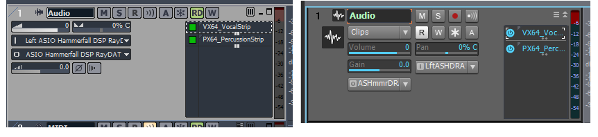
What on earth does "LftASHDRA" even mean...?
A picture is a thousand words... and this is just one instance of X1's UI failure. How can anyone defend X1 with comparisons like the above??? Brandon Ryan [Cakewalk]
Because it takes design, development and testing time.
Careful now... I'm only seeing one of those things in X1. Brandon Ryan [Cakewalk]
If it was so easy then why don't we just take the afternoon and do it?
* No comment *
|
Middleman
Max Output Level: -31.5 dBFS

- Total Posts : 4397
- Joined: 2003/12/04 00:58:50
- Location: Orange County, CA
- Status: offline
Re:X1 User interface looks cluttered!
2011/01/27 02:55:45
(permalink)
n0rd, purely your opinion. I happen to like the way the controls are now. Visually more interesting and easier on the eyes.
|
Rothchild
Max Output Level: -61 dBFS

- Total Posts : 1479
- Joined: 2003/11/27 13:15:24
- Status: offline
Re:X1 User interface looks cluttered!
2011/01/27 03:00:29
(permalink)
So you would just go grabbing envelopes in 8.5 w/o switching to the envelope tool so you woudln't accidentally move clips? If so, then I comend your dexterity and bravery. /adds dexterous and brave to curriculum vitae Clip lock is good too. ;-) Brandon, I'm keen to come up to X1, can you 'let slip' if 'b' is going to return the necessary functionality to the TV header; ie ability to have it define buttons and button order (inc phase) and the ability to colour code the control sliders (so it's easy to see which is which at a glance) On all the screenies I've seen they are all blue? I've not used a vertical 'mixer' style control (including the strip inspector) since I came over to SonarXL and I don't want to / understand why I should have to now.... Child
|
John
Forum Host

- Total Posts : 30467
- Joined: 2003/11/06 11:53:17
- Status: offline
Re:X1 User interface looks cluttered!
2011/01/27 03:06:40
(permalink)
It may be that NoRd doesn't know which is which. LOL
8.5.3 is on the left X1 is on the right. Do you still think it has a UI failure?
I too like X1 over 8.5.3 in the looks department.
|
allenheresy
Max Output Level: -90 dBFS

- Total Posts : 43
- Joined: 2011/01/25 04:05:34
- Status: offline
Re:X1 User interface looks cluttered!
2011/01/27 03:09:54
(permalink)
Well, I have spent the past day and today attempting to compose a song in X1... and I am much more pleased with it now than I was before. The simple ability to call up the little modules when you need them. My advice to everyone: Spend the time to re-create a new "blank" template. Get everything set up just how you want it and save the template. Once I got the interface to look and work how I wanted, it is quite nice.
I will chock the hatred up to people just not being used to the interface, or just not taking the time to customize it properly. Oddly, I noticed when A/B from X1 to 8.5, the audio sound richer for some reason... and it shouldn't. But yeah, seriously... I hit "I" and it gives me a channel strip for the selected track and its destination... hit "I" again and it goes away... instantly. Same thing with the multi-dock console. I feel it has actually streamlined my workflow once I learned its little quirks.
Now, to fix the real bugs.
|
n0rd
Max Output Level: -86 dBFS
- Total Posts : 237
- Joined: 2010/11/02 02:18:00
- Location: Down Under (Australia)
- Status: offline
Re:X1 User interface looks cluttered!
2011/01/27 03:37:17
(permalink)
Reply in 8.5:
Are you guys for real???
Reply in X1:
AryugysFrl??
Look carefully: "Left ASIO Hammerfall DSP Ray" vs "LftASHDRA"
I'm being objective - not subjective. I'm not saying whether it looks "pretty" or not...
|
allenheresy
Max Output Level: -90 dBFS
- Total Posts : 43
- Joined: 2011/01/25 04:05:34
- Status: offline
Re:X1 User interface looks cluttered!
2011/01/27 03:40:31
(permalink)
n0rd
Reply in 8.5:
Are you guys for real???
Reply in X1:
AryugysFrl??
Look carefully: "Left ASIO Hammerfall DSP Ray" vs "LftASHDRA"
Yeah, the way this works is keep the first and last letter of each word... and remove every vowel that is not the first or last letter... most of the time. Just fyi to the OP.
|
UnderTow
Max Output Level: -37 dBFS

- Total Posts : 3848
- Joined: 2004/01/06 12:13:49
- Status: offline
Re:X1 User interface looks cluttered!
2011/01/27 05:54:24
(permalink)
John
If you don't know what I'm talking about I don't know how to explain it to you. Buss track in the TV you know the thing that has a track next to a buss.
You could start by explaining whether you are talking about a track or a bus and then you could go on to explain what is editable about it... Buses live in the Bus pane in Sonar. Are you talking about that? Is it really that hard to explain?  Surely if it is in Sonar it must be in the manual and have a proper name. UnderTow
|
The Maillard Reaction
Max Output Level: 0 dBFS

- Total Posts : 31918
- Joined: 2004/07/09 20:02:20
- Status: offline
.
post edited by Splat Chat O'samplemashy - 2018/12/21 17:16:23
|
guitarmikeh
Max Output Level: -72 dBFS

- Total Posts : 942
- Joined: 2005/03/11 23:16:02
- Location: ?
- Status: offline
Re:X1 User interface looks cluttered!
2011/01/27 09:07:21
(permalink)
mike_mccue
Facts is facts

click view image to see as 100% scale
I cant argue (not looking to) with Mr. McCue on this. I totally agree. JMHO
I harbor no ill will towards any man.
|
The Maillard Reaction
Max Output Level: 0 dBFS
- Total Posts : 31918
- Joined: 2004/07/09 20:02:20
- Status: offline
.
post edited by Splat Chat O'samplemashy - 2018/12/21 17:16:47
|
UnderTow
Max Output Level: -37 dBFS
- Total Posts : 3848
- Joined: 2004/01/06 12:13:49
- Status: offline
Re:X1 User interface looks cluttered!
2011/01/27 09:23:26
(permalink)
mike_mccue
Facts is facts
click view image to see as 100% scale
Excellent! It is hard to argue with these facts (although I am sure some will). And I so agree about the minimise maximise buttons. Cakewalk are quick to tell use about limited resources but they WASTE time on trying to reinvent something that does not in any way need reinventing and then come up with something that is actually inferior to the original design. Having the minimise and maximise icons on the top right of a window is not only familiar to everyone having used Sonar for a while but is the standard for every well designed Windows application for decades. How many of you have accidentally clicked the Layers button when you wanted to minimise a track? The fact that the Layers button is a bunch of horizontal lines doesn't help. It adds to the confusion. UnderTow
|
guitarmikeh
Max Output Level: -72 dBFS
- Total Posts : 942
- Joined: 2005/03/11 23:16:02
- Location: ?
- Status: offline
Re:X1 User interface looks cluttered!
2011/01/27 09:35:48
(permalink)
How many of you have accidentally clicked the Layers button when you wanted to minimise a track? The fact that the Layers button is a bunch of horizontal lines doesn't help.
Raises hand. re.: layers....to be specific layers were vertical lines when not showing and horizontal when shown, in previous versions. (just throwing that out there). now it horizontal lines when not shown. why change this. for the sake of change? I dont know..  sometimes I feel like a beaten puppy. the console is worse. who thinks only 2 viewable sends is acceptable? Not I! I dont know if I should have brought that up.
post edited by guitarmikeh - 2011/01/27 09:38:59
I harbor no ill will towards any man.
|
neiby
Max Output Level: -75 dBFS

- Total Posts : 765
- Joined: 2007/06/19 14:34:54
- Status: offline
Re:X1 User interface looks cluttered!
2011/01/27 10:15:00
(permalink)
mike_mccue
Facts is facts
click view image to see as 100% scale
That's very difficult to disagree with. I think all of these issues could and probably should be tweaked in the new UI. I don't see a downside to it other than the developers time to fix the cascade of UI issues that might result from fixing these issues. Great job, Mike. That type of thing is very helpful.
|
tarsier
Max Output Level: -45 dBFS

- Total Posts : 3029
- Joined: 2003/11/07 11:51:35
- Location: 6 feet under
- Status: offline
Re:X1 User interface looks cluttered!
2011/01/27 10:20:52
(permalink)
Thanks guys, I thought my little comparison screenshot was going to be ignored. But Mike, I actually like track icons.  When I have a lot of tracks going, I can assign nice distinguishing icons to them to easily see what's what. And that shot was essentially a non-customized quickie default of both setups. I'd normally do some widget re-arrangement to make the layout even more useful for me in 8.5. No amount of re-arranging can save X1. The cramped, minimal spacing of X1 is hard coded. One thing that wasn't pointed out was the change of the record button from 'R' to 'Red Dot', and automation read from 'RD' to 'R'. I can't tell you how many times I've tried to arm a track in X1 by pressing the 'R' button. Really bad change. MSR are great choices for button labels. RDW was perhaps less so, but a better solution would have been to maintain MSR and make the automation buttons have a little squiggly 'automation' graphic along with RDW kinda like the old 'select envelopes with clips' button.
post edited by tarsier - 2011/01/27 16:01:53
|
The Maillard Reaction
Max Output Level: 0 dBFS
- Total Posts : 31918
- Joined: 2004/07/09 20:02:20
- Status: offline
.
post edited by Splat Chat O'samplemashy - 2018/12/21 17:17:08
|
Keni
Max Output Level: -17.5 dBFS

- Total Posts : 5769
- Joined: 2003/11/04 10:42:15
- Location: Willits, CA USA
- Status: offline
Re:X1 User interface looks cluttered!
2011/01/27 11:54:56
(permalink)
Yeah!
Far too cluttered...
Attempting to get all of my necessary tools visible takes so much screen space that it leaves very little room to work... Cluttered is a "nice" word to describe it.... and all those extra areas for the new BIG-3 windows dividers.... Wasted space. the Inspector used to disappear when closed... Now it takes up almost a half inch of screen from top to bottom even when closed!!!
Keni
|
UnderTow
Max Output Level: -37 dBFS
- Total Posts : 3848
- Joined: 2004/01/06 12:13:49
- Status: offline
Re:X1 User interface looks cluttered!
2011/01/27 11:55:31
(permalink)
tarsier
But Mike, I actually like track icons. When I have a lot of tracks going, I can assign nice distinguishing icons to them to easily see what's what.
Sure but at the very least they could have done something like:  The Large Icon is only visible when the track is open. There is no need for the Small Icon AND the Big Icon. UnderTow
|
Guest
Max Output Level: -25.5 dBFS

- Total Posts : 4951
- Joined: 2009/08/03 10:50:51
- Status: online
Re:X1 User interface looks cluttered!
2011/01/27 12:26:18
(permalink)
mike_mccue
Facts is facts
click view image to see as 100% scale
You missed the phase button in 8.5.
|
Dave Modisette
Max Output Level: 0 dBFS
- Total Posts : 11050
- Joined: 2003/11/13 22:12:55
- Location: Brandon, Florida
- Status: offline
Re:X1 User interface looks cluttered!
2011/01/27 12:39:11
(permalink)
One thing that wasn't pointed out was the change of the record button from 'R' to 'Red Dot', and automation read from 'RD' to 'R'. I can't tell you how many times I've tried to arm a track in X1 by pressing the 'R' button. Really bad change. I am in total agreement on this one. I've done the same thing.
|
Dave Modisette
Max Output Level: 0 dBFS
- Total Posts : 11050
- Joined: 2003/11/13 22:12:55
- Location: Brandon, Florida
- Status: offline
Re:X1 User interface looks cluttered!
2011/01/27 12:40:27
(permalink)
The Large Icon is only visible when the track is open. There is no need for the Small Icon AND the Big Icon. Good point and great idea.
|
HumbleNoise
Max Output Level: -46 dBFS

- Total Posts : 2946
- Joined: 2004/01/04 12:53:50
- Status: offline
Re:X1 User interface looks cluttered!
2011/01/27 16:28:47
(permalink)
Both the small and large icons can be turned off and on from the 'views' menu. Track view 'show in header' for the small icon.
post edited by HumbleNoise - 2011/01/27 16:30:01
Humbly Yours Larry Sonar X2 x64 MAudio 2496 Yamaha MG 12/4 Roland XV-88 Intel MB with Q6600 and 4 GB Ram NVidia 9800 GTX Windows 7 x64 Home Premium
|
neiby
Max Output Level: -75 dBFS
- Total Posts : 765
- Joined: 2007/06/19 14:34:54
- Status: offline
Re:X1 User interface looks cluttered!
2011/01/27 16:29:45
(permalink)
HumbleNoise
Both the small and large icons can be turned off and on from the 'views' menu.
There you go again, coming in here spouting off reasonable and accurate suggestions. What is wrong with you?? ;)
|
HumbleNoise
Max Output Level: -46 dBFS
- Total Posts : 2946
- Joined: 2004/01/04 12:53:50
- Status: offline
Re:X1 User interface looks cluttered!
2011/01/27 16:34:08
(permalink)
I have 3 or 4 different custom track views set up for each task. One for tracking with minimal data, one for MIDI that shows more relevant MIDI info, one that shows all. Still does not excuse those weird shortened names but I just work past it.
Humbly Yours Larry Sonar X2 x64 MAudio 2496 Yamaha MG 12/4 Roland XV-88 Intel MB with Q6600 and 4 GB Ram NVidia 9800 GTX Windows 7 x64 Home Premium
|
FastBikerBoy
Forum Host
- Total Posts : 11326
- Joined: 2008/01/25 16:15:36
- Location: Watton, Norfolk, UK
- Status: offline
Re:X1 User interface looks cluttered!
2011/01/27 17:32:09
(permalink)
mike_mccue
FastBikerBoy
@mike_mccue
I also answered your questions (as a MCU user) here's a repost
mike_mccue
Can you access snap settings with your hardware controller? I really don't know so I am asking.
If I wanted to. I could program them to the MCU F keys. I personally don't I prefer to access them via the CB which pops up or down with a single keypress. Did I mention screensets? 
mike_mccue
Can you see when the snap settings change on you without warning?
I know when they are going to change. It's switching to the PRV that brings out that bug. I work round it by opening the PRV and then setting the snap-to. If you set the snap-to and then open the PRV it (the snap-to) will change to the PRV's snap-to setting. Of course if it's the same you won't notice anything.
I do take your point though and would rather the bug was fixed. X1b? Have I mentioned Screensets?
mike_mccue
How would you set a loop? With the hotkey? How would you confirm what the loop start and end start times became?
Loop times are easily set with an MCU. Press the loop mode key, M1 + RW key sets start, M1 + FF key sets end. Turn loop on. Very quick. I can't remember the last time I set a loop using the mouse/comp keyboard.
A good control surface is worth it's weight in gold once it's been learnt. The BCF 2000 in Mackie mode is a great, cheap way of getting your feet wet......
Did I mention Screensets............. okay I've got my coat............
Let's cut to the chase...
Re Snap settings: Does your control surface have some form of text readout or do you rely on memory? Can I walk up to your controller and use it the way you do?
RE Loops: When you set the the loop on you control surface do you have a text readout that lets you confirm that the loop is set exactly as you intended?
I worked with a hardware controller on Monday night at a session in town... it had all kinds of dynamic text displays on it... but, I didn't try any of the stuff I am asking about... so I don't know how it compares. One thing I liked about that controller was that I was able to sit down and get right to work because everything was clearly labeled and the dynamic text displays on each button, knob, or slider confirmed all my adjustments were what I thought they were... and the PC keyboard was fully labeled and color coded as well.
I personally don't have much interest in Hardware controllers... they seem, to me, like a waste of valuable floor space.
I'm sorry I did not see or acknowledge your post... thanks for the follow up.
best regards,
mike
Hi Mike In answer to the questions. No the MCU doesn't have snap to as a visual on it. I read it from the Control Bar although I'm usually aware of which screenset I'm in and have snap-to times set per SS. I doubt very much whether you'd be able to use the controller as I do simply because the key presses and combinations are in-grained in me from constant use, although of course the faders/mute/solo etc are straight forward enough. I always have a hard snapping "snap-to" set so loops always go to where I set them. There is an LED time readout in the format of your choice visible at the time of setting the start & end loops but TBH I never look at that I set them in conjunction with what I see on the screen. The snap to changing when opening the PRV bug needs addressing though. I can understand those that don't particularly like hardware controllers but I'd be hopelessly lost without mine, I do however find I'm using the keyboard much more in X1 than I have previous versions. Not because I have to but because I now find it quicker than previous versions especially with the multidock, inspector and control bar shortcuts. Did I mention screensets?
|
The Maillard Reaction
Max Output Level: 0 dBFS
- Total Posts : 31918
- Joined: 2004/07/09 20:02:20
- Status: offline
.
post edited by Splat Chat O'samplemashy - 2018/12/21 17:17:26
|
...wicked
Max Output Level: -1.5 dBFS

- Total Posts : 7360
- Joined: 2003/12/18 01:00:56
- Location: Seattle
- Status: offline
Re:X1 User interface looks cluttered!
2011/01/27 18:48:12
(permalink)
Yah the new indention/collapsing logic within the track's widget pane seems odd to me too. Plus, it's not changeable. This is one area that is totally ripe to open up to customization. Imagine custom buttons that are key-bound to various functions (bounce,for example) arranged how you like 'em.
Plus, buttons could have custom logic for when track height changes, so a button in the middle of the list could be designated to always pop into the collapsed area when the track is shrunk.
=========== The Fog People =========== Intel i7-4790 16GB RAM ASUS Z97 Roland OctaCapture Win10/64 SONAR Platinum 64-bit billions VSTs, some of which work
|
lorneyb2
Max Output Level: -58.5 dBFS

- Total Posts : 1667
- Joined: 2007/04/26 04:02:10
- Location: Saskatchewan, Canada
- Status: offline
Re:X1 User interface looks cluttered!
2011/01/27 19:22:21
(permalink)
Keni
Yeah!
Far too cluttered...
Attempting to get all of my necessary tools visible takes so much screen space that it leaves very little room to work... Cluttered is a "nice" word to describe it.... and all those extra areas for the new BIG-3 windows dividers.... Wasted space. the Inspector used to disappear when closed... Now it takes up almost a half inch of screen from top to bottom even when closed!!!
Keni
Keni, For the Inspector, undock it(menu via down arrow in upper left corner) and use "I" to toggle it off and on. Then your 3/8" of space is reclaimed(unless of course you have a 60" monitor). (It also works with your favourite Sonar X1 Helper program "I" button)
Sonar Platinum 64bit, Win 8.1 Pro 64bit, Quad Core 3.2GHz, 16G ram, Edirol FA 101, Nvidia EW (Platinum Orchestra, Hollywood Strings, Pianos, Gypsy, Fab 4, Ministry of Rock,Choirs, etc)
|
B San
Max Output Level: -85 dBFS

- Total Posts : 282
- Joined: 2007/07/10 20:14:51
- Status: offline
Re:X1 User interface looks cluttered!
2011/01/27 19:27:42
(permalink)
mike_mccue
Facts is facts
click view image to see as 100% scale
n0rd EXACTLY!!
Intel Core 2 Quad Q9650 3.0GHz, 8GB RAM Corsair xms2 (4 x 2B), Asus P5Q Delux, NVIDIA GeForce 8400GS, RME AIO, UA 2192, Lynx Aurora 8, UAD-2 Quad (x2), UAD-1 PCI, Duende PCIe, Powercore FW, Dual Boot system ft. XP Pro SP2 & Win 7 Pro 64bit, Studio One Pro v.2, Sonar 8.5.3, Samplitude ProX, Sonar X1d Expanded
|
HumbleNoise
Max Output Level: -46 dBFS
- Total Posts : 2946
- Joined: 2004/01/04 12:53:50
- Status: offline
Re:X1 User interface looks cluttered!
2011/01/27 19:38:52
(permalink)
mike_mccue
HumbleNoise
Both the small and large icons can be turned off and on from the 'views' menu. Track view 'show in header' for the small icon.
Larry,
Yes indeed the icons can be turned off but doing so does not reclaim any space... If you use icons you can have more or less wasted space... if you don't use icons then you simply have more wasted space.
I really dislike the wasted space.
best regards,
mike
Yeah I agree with you Mike about wasted space. I was only posting re: that single point of showing both icons, not about wasting space.
Humbly Yours Larry Sonar X2 x64 MAudio 2496 Yamaha MG 12/4 Roland XV-88 Intel MB with Q6600 and 4 GB Ram NVidia 9800 GTX Windows 7 x64 Home Premium
|