Helene Kolpakova
Max Output Level: -90 dBFS

- Total Posts : 16
- Joined: 2015/01/15 16:46:37
- Status: offline

Re: UGLY UI... SpLat 2016.5
2016/05/29 11:15:59
(permalink)
Sorry, but I can't work in Tungsten. I simply don't see anything. It looks similar to Sonar pre-skylight with tons of toolbar buttons. Here come the comparison pics. http://imgur.com/a/vk15u The cluttered track controls and control bar, lack of track colours, lack of borders and sections - all that render it completely unusable for me. All I see in the console are meters and the top relatively clean part. Everything else is a decorated new-year-tree LED-like mess. And those laser red dots everywhere instead of Arm for record markers. The FX Bins in the pro-channel are still blue by the way. Overall, Mercury is sure not ideal, too, but I can at least work in it. And yes, I agree, SONAR needs an ARTIST. And the SkyLight needs a rework too, with attention to CONSISTENCY with actual use cases, not just in colours among all elements.
post edited by Helene Kolpakova - 2016/05/29 11:40:06
|
John
Forum Host
- Total Posts : 30467
- Joined: 2003/11/06 11:53:17
- Status: offline
Re: UGLY UI... SpLat 2016.5
2016/05/29 11:43:31
(permalink)
☄ Helpfulby chuckebaby 2016/05/29 17:00:35
This thread may have run its course. I'm seeing some personal attacks here and I'm close to locking this thread. Tone it down or have it locked.
|
ampfixer
Max Output Level: -20 dBFS

- Total Posts : 5508
- Joined: 2010/12/12 20:11:50
- Location: Ontario
- Status: offline
Re: UGLY UI... SpLat 2016.5
2016/05/29 12:44:11
(permalink)
☄ Helpfulby SteveStrummerUK 2016/05/30 18:33:23
Don't lock it. The powers that be have let the other threads run their course and this one is interesting. People are talking about a new feature. Those on the fringe are easily identified and have some good points to make. If YOU don't like the thread then don't read it.
The customizable interface was a feature many of us have been longing for since it was announced. I don't think it was delivered as promised and want to see some discussion about it. One new colour scheme does not equal a customizable UI.
Regards, John I want to make it clear that I am an Eedjit. I have no direct, or indirect, knowledge of business, the music industry, forum threads or the meaning of life. I know about amps. WIN 10 Pro X64, I7-3770k 16 gigs, ASUS Z77 pro, AMD 7950 3 gig, Steinberg UR44, A-Pro 500, Sonar Platinum, KRK Rokit 6
|
Unknowen
Max Output Level: -65 dBFS

- Total Posts : 1276
- Joined: 2014/11/07 11:27:09
- Status: offline
Re: UGLY UI... SpLat 2016.5
2016/05/29 12:58:54
(permalink)
Helene Kolpakova
Sorry, but I can't work in Tungsten. I simply don't see anything. It looks similar to Sonar pre-skylight with tons of toolbar buttons. Here come the comparison pics.
http://imgur.com/a/vk15u
The cluttered track controls and control bar, lack of track colours, lack of borders and sections - all that render it completely unusable for me. All I see in the console are meters and the top relatively clean part. Everything else is a decorated new-year-tree LED-like mess. And those laser red dots everywhere instead of Arm for record markers. The FX Bins in the pro-channel are still blue by the way.
Overall, Mercury is sure not ideal, too, but I can at least work in it.
And yes, I agree, SONAR needs an ARTIST. And the SkyLight needs a rework too, with attention to CONSISTENCY with actual use cases, not just in colours among all elements.
Yea, I just tried to use it on my real system and it just blinds me. no joke. But I'm in a room about 75% dark. I need more definition. BUT it's not a big deal as I just set it back. I would like to see a full darker color palette of Mercury moving away from any pastels and but with full track lane colors...
Hay look, Somethings are not locked in stone... lol 3/18/2019
|
Unknowen
Max Output Level: -65 dBFS
- Total Posts : 1276
- Joined: 2014/11/07 11:27:09
- Status: offline
Re: UGLY UI... SpLat 2016.5
2016/05/29 12:59:56
(permalink)
Hay look, Somethings are not locked in stone... lol 3/18/2019
|
StepD
Max Output Level: -79 dBFS

- Total Posts : 594
- Joined: 2003/11/08 01:03:52
- Status: offline
Re: UGLY UI... SpLat 2016.5
2016/05/29 14:19:09
(permalink)
I think the design was pretty well thought out for a first attempt at an alternate darker theme. It's actually hilarious that anyone thinks a programmer did the design. It would be a complete nightmare if that was the case. :-) For something so subjective, the informal percentage of likes compared to dislikes is surprisingly high, so if I was CW, I would consider it a big success. Hopefully they can figure out a way to colorize the few remaining controls that they weren't able to for this attempt. I can't wait to see what everyone comes up with when they have the ability to do it themselves. Should be pretty funny.
Core2 6600 2.40 GHz, ASUS P5B Deluxe, 8GB RAM, GeForce GT 630 2GB, 3 Seagate Sata, Echo AudioFire 4 asio, Windows 10 Pro 64-bit, Sonar Platinum, Cakewalk by Bandlab
|
Unknowen
Max Output Level: -65 dBFS
- Total Posts : 1276
- Joined: 2014/11/07 11:27:09
- Status: offline
Re: UGLY UI... SpLat 2016.5
2016/05/29 16:02:51
(permalink)
I said ugly... As a small example...  If this was done by an artist... CW needs a lead artist to tell the artist what to fix....
post edited by Dave000 - 2016/05/29 16:26:18
Hay look, Somethings are not locked in stone... lol 3/18/2019
|
karhide
Max Output Level: -81 dBFS

- Total Posts : 457
- Joined: 2007/03/30 04:22:13
- Location: Southampton / Paris
- Status: offline
Re: UGLY UI... SpLat 2016.5
2016/05/29 16:13:05
(permalink)
Dave000
I said ugly...
As a small example...
If this was done by an artist... CW needs a lead artist to tell the artist what to fix....
I have looked on two screens and mine does not look like yours. Have you looked at the calibration of your screen?
Studio: Sonar Platinum/Cakewalk by Bandlab Intel Core i7 32GB RAM Samsung Evo 1TB system drive Windows 10 64bit - RME FireFace UFX - Focusrite OctoPre MK II - Audient Mico Mobile: Sonar Platinum/Cakewalk by Bandlab Intel Core i7 8GB RAM Samsung Evo 1TB system drive Windows 10 64bit - RME FireFace 400 Mobile2: Cakewalk by Bandlab Intel Core i7 8GB RAM 256 GB System Drive Windows 10 64 bit http://www.karhide.co.uk/https://karhide.bandcamp.com
|
Unknowen
Max Output Level: -65 dBFS
- Total Posts : 1276
- Joined: 2014/11/07 11:27:09
- Status: offline
Re: UGLY UI... SpLat 2016.5
2016/05/29 16:19:18
(permalink)
karhide
Dave000
I said ugly...
As a small example...
If this was done by an artist... CW needs a lead artist to tell the artist what to fix....
I have looked on two screens and mine does not look like yours. Have you looked at the calibration of your screen?
So you see that's your problem... if it looks wrong on mine and I only copy and paste it, you should see it the way you see it on yours and not mine... And I looked at it on 3 systems with 6 monitors, yes some are a bit different BUT the differents between "the colors" is always off...
Hay look, Somethings are not locked in stone... lol 3/18/2019
|
karhide
Max Output Level: -81 dBFS
- Total Posts : 457
- Joined: 2007/03/30 04:22:13
- Location: Southampton / Paris
- Status: offline
Re: UGLY UI... SpLat 2016.5
2016/05/29 16:29:20
(permalink)
Not my problem because my UI looks pretty good but your screen shot looks set like it has been processed in some other way. Have you reset all your settings back to the default?
Studio: Sonar Platinum/Cakewalk by Bandlab Intel Core i7 32GB RAM Samsung Evo 1TB system drive Windows 10 64bit - RME FireFace UFX - Focusrite OctoPre MK II - Audient Mico Mobile: Sonar Platinum/Cakewalk by Bandlab Intel Core i7 8GB RAM Samsung Evo 1TB system drive Windows 10 64bit - RME FireFace 400 Mobile2: Cakewalk by Bandlab Intel Core i7 8GB RAM 256 GB System Drive Windows 10 64 bit http://www.karhide.co.uk/https://karhide.bandcamp.com
|
Unknowen
Max Output Level: -65 dBFS
- Total Posts : 1276
- Joined: 2014/11/07 11:27:09
- Status: offline
Re: UGLY UI... SpLat 2016.5
2016/05/29 16:33:16
(permalink)
karhide
Not my problem because my UI looks pretty good but your screen shot looks set like it has been processed in some other way. Have you reset all your settings back to the default?
Well then put up your screen...
Hay look, Somethings are not locked in stone... lol 3/18/2019
|
karhide
Max Output Level: -81 dBFS
- Total Posts : 457
- Joined: 2007/03/30 04:22:13
- Location: Southampton / Paris
- Status: offline
Re: UGLY UI... SpLat 2016.5
2016/05/29 16:45:07
(permalink)
I will in the morning but everything is turned off for the evening. But you did not answer the question...
Studio: Sonar Platinum/Cakewalk by Bandlab Intel Core i7 32GB RAM Samsung Evo 1TB system drive Windows 10 64bit - RME FireFace UFX - Focusrite OctoPre MK II - Audient Mico Mobile: Sonar Platinum/Cakewalk by Bandlab Intel Core i7 8GB RAM Samsung Evo 1TB system drive Windows 10 64bit - RME FireFace 400 Mobile2: Cakewalk by Bandlab Intel Core i7 8GB RAM 256 GB System Drive Windows 10 64 bit http://www.karhide.co.uk/https://karhide.bandcamp.com
|
chuckebaby
Max Output Level: 0 dBFS

- Total Posts : 13146
- Joined: 2011/01/04 14:55:28
- Status: offline
Re: UGLY UI... SpLat 2016.5
2016/05/29 16:45:42
(permalink)
never mind blocked
post edited by chuckebaby - 2016/05/29 17:26:17
Windows 8.1 X64 Sonar Platinum x64 Custom built: Asrock z97 1150 - Intel I7 4790k - 16GB corsair DDR3 1600 - PNY SSD 220GBFocusrite Saffire 18I8 - Mackie Control
|
SilkTone
Max Output Level: -59.5 dBFS

- Total Posts : 1566
- Joined: 2003/11/10 17:41:28
- Status: offline
Re: UGLY UI... SpLat 2016.5
2016/05/29 16:46:41
(permalink)
This thread got a bit too intense so not sure if we can have a rational discussion, but as I mentioned before I have a different issue with Tungsten. The loss of depth cues is significant, let me show these two screenshots of TouchDAW, which matches Tungsten's colors very closely: 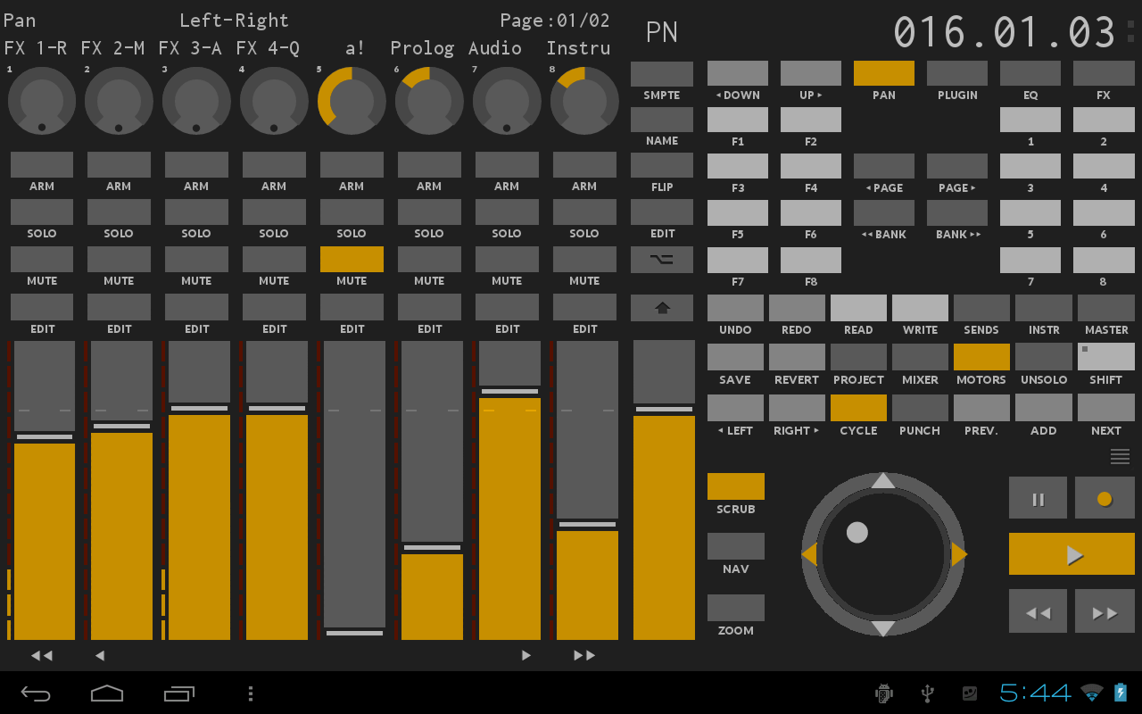  [Sorry they are scaled down in the forum. The original images are here and here] The two use the exact same colors. But to me the top one is not only ugly, but the fact that there are no depth cues required the designer to use highly contrasting colors so that you can see where one thing ends and another starts. In the bottom image, the need for highly contrasting colors is reduced dramatically because it takes your mind a fraction of a second to clearly identify each control. I can tell immediately what I can interact with without needing to consciously think about it 1st. Anything that is raised is interactable. What I would love is a non-flat Tungsten theme similar to what the 2nd screenshot looks like. Until then I'll stick to Mercury. BTW, did anyone see that Panu posted on the Sonar Mods Facebook page that the Tungsten theme looks "surprisingly like my Dark Side mod with EXE colors". I don't use Duckbar so I'm not familiar with Panu's work.
post edited by SilkTone - 2016/05/29 17:13:22
Windows 10 Pro x64, SONAR Platinum 64-bitFocusrite Scarlett 18i8 USB, ASRock Z97 Pro4, Haswell 4790k @ 4.4GHz32GB DDR3/1600, 500GB SSD (OS) + 256 GB SSD + 3TB MDNVIDIA GTX-1070, 40" 4K Monitor + 1 Monitor in ISO booth
|
Unknowen
Max Output Level: -65 dBFS
- Total Posts : 1276
- Joined: 2014/11/07 11:27:09
- Status: offline
Re: UGLY UI... SpLat 2016.5
2016/05/29 16:59:30
(permalink)
chuckebaby
Dave, go make some music man.
seriously, this is getting old.
No Music for 2 weeks :( just killing time... TOO much stuff going on this week... multi tasking anyhow... lol ;) over and out! :)
Hay look, Somethings are not locked in stone... lol 3/18/2019
|
aghschwabe
Max Output Level: -90 dBFS
- Total Posts : 37
- Joined: 2014/10/07 00:22:44
- Status: offline
Re: UGLY UI... SpLat 2016.5
2016/05/29 18:05:56
(permalink)
Dave000
BTW... people not in the software field don't realize that most programmers don't believe that they need artists...
FACT!
Most users don't want to pay what it costs to have professional graphics developed...FACT! If there were no other updates, the darker Titanium would be just fine with me (I've lived with the vanilla for this long after all). Seriously, Dave, we're all very glad you don't like the new theme. It's three clicks to switch back to vanilla and let those of us who enjoy Titanium (I'm holding out for a Blue Steel or Magnum too), enjoy it. I find it a lot easier to use, and it looks more familiar because things like the knob-sweep indicators are becoming a standard visual language in so many VSTs now. This is one of those weird cases where the complaint is a non-complaint: "I don't like that thing that you're not forcing me to use!!!" *shrug* ps: thx for the update bakers!
|
townstra
Max Output Level: -88 dBFS

- Total Posts : 118
- Joined: 2013/10/09 18:25:53
- Location: Denton, TX
- Status: offline
Re: UGLY UI... SpLat 2016.5
2016/05/29 19:02:00
(permalink)
As long as I can still see it and record in it I don't care what color they make it. I was fine with the last version and I like this one too. Sonar has come a long way in the last few years.
Regards, Tracy Sonar Platinum, Harrison Mixbus 4, Melodyne 4 Studio, Slate Digital FG-X, ARC 2, Windows 10 Pro x64, Intel I7-4790@3.6ghz, 16 Gb RAM, GeForce GT730, Focusrite Scarlett 18i20, Behringer ADA8200, Prodipe Ribbon 8 monitors, Prodipe Pro5 monitors, Behringer B2030P monitors, Korg nanokontrol, Korg microKey, Samson Graphite MF8, rack full of channel strips and processors, lots of guitars, basses, and pedals. www.TracyTowns.com
|
John
Forum Host
- Total Posts : 30467
- Joined: 2003/11/06 11:53:17
- Status: offline
Re: UGLY UI... SpLat 2016.5
2016/05/29 19:02:35
(permalink)
ampfixer
Don't lock it. The powers that be have let the other threads run their course and this one is interesting. People are talking about a new feature. Those on the fringe are easily identified and have some good points to make. If YOU don't like the thread then don't read it.
The customizable interface was a feature many of us have been longing for since it was announced. I don't think it was delivered as promised and want to see some discussion about it. One new colour scheme does not equal a customizable UI.
I have to read the thread I'm a host. My job in part is to stop personal attacks. Your response was fine until you said don't read the thread. I would refrain in future from telling a host to not read something.
|
ampfixer
Max Output Level: -20 dBFS
- Total Posts : 5508
- Joined: 2010/12/12 20:11:50
- Location: Ontario
- Status: offline
Re: UGLY UI... SpLat 2016.5
2016/05/29 22:11:01
(permalink)
☄ Helpfulby bronsoncox 2016/05/29 22:59:13
You're a host John not a minor deity. Hubris does not become you.
Regards, John I want to make it clear that I am an Eedjit. I have no direct, or indirect, knowledge of business, the music industry, forum threads or the meaning of life. I know about amps. WIN 10 Pro X64, I7-3770k 16 gigs, ASUS Z77 pro, AMD 7950 3 gig, Steinberg UR44, A-Pro 500, Sonar Platinum, KRK Rokit 6
|
thaddeusjon
Max Output Level: -90 dBFS
- Total Posts : 33
- Joined: 2015/01/23 20:15:32
- Status: offline
Re: UGLY UI... SpLat 2016.5
2016/05/29 23:17:47
(permalink)
The new Sonar Tungsten reminds me of PreSonus Studio One 3. The difference between the two are the graphic detail of the dails in Sonar versus Studio One.
I like it, just wished when you color code in Tungsten, it would've became the color within a black background on the entire track in console view.
Awesome job, Bakers...
|
tenfoot
Max Output Level: -53.5 dBFS

- Total Posts : 2186
- Joined: 2015/01/22 18:12:07
- Location: Qld, Australia
- Status: offline
Re: UGLY UI... SpLat 2016.5
2016/05/29 23:30:57
(permalink)
ampfixer
Don't lock it.
If YOU don't like the thread then don't read it.
Calling hubris after posting this seems a bit rich ampfixer. 
Bruce. Sonar Platinum 2017-09, Studio One 3.5.3, Win 10 x64, Quad core i7, RME Fireface, Behringer X32 Producer, Behringer X32 Rack, Presonus Faderport, Lemure Software Controller (Android), Enttec DMXIS VST lighting controller, Xtempo POK.
|
Grumbleweed_
Max Output Level: -72 dBFS

- Total Posts : 915
- Joined: 2007/11/01 09:13:58
- Location: Southampton, England
- Status: offline
Re: UGLY UI... SpLat 2016.5
2016/05/30 03:09:03
(permalink)
What's has an Egyptian dip got to do with this?
Grum.
|
Unknowen
Max Output Level: -65 dBFS
- Total Posts : 1276
- Joined: 2014/11/07 11:27:09
- Status: offline
Re: UGLY UI... SpLat 2016.5
2016/05/30 08:30:20
(permalink)
karhide
I will in the morning but everything is turned off for the evening. But you did not answer the question...
I use Photoshop, RGB 16 million colors, Jpg file... It's truly a no brainer. What I see is what I get. I've been doing computer graphics for over 20 years so I could be wrong but I'm not! ttfn
Hay look, Somethings are not locked in stone... lol 3/18/2019
|
rivers88
Max Output Level: -84 dBFS

- Total Posts : 328
- Joined: 2011/02/08 10:04:05
- Location: Knoxville, TN & Huntsville, AL USA
- Status: offline
Re: UGLY UI... SpLat 2016.5
2016/05/30 09:58:33
(permalink)
Whoa - About dropped my coffee cup, LOL! For some reason that last post (taken in context with the rest of this thread) reminded me of Nicolas Cage in that infamous movie "Fire Birds". "I am the greatest, I am the greatest...". 
post edited by rivers88 - 2016/05/30 10:29:37
|
mourningpyre
Max Output Level: -90 dBFS
- Total Posts : 21
- Joined: 2014/10/22 10:33:43
- Location: Kiev, Ukraine
- Status: offline
Re: UGLY UI... SpLat 2016.5
2016/05/30 10:46:54
(permalink)
The new UI is fantastic for me. I really appreciate the darker colours and I definitely prefer it to the 'Mercury' design. I liked the 'Mercury' design at first, but after so many years the change is great. I'm definitely looking forward to the future tools to make our own colour sets - I'll be all over that!
|
ampfixer
Max Output Level: -20 dBFS
- Total Posts : 5508
- Joined: 2010/12/12 20:11:50
- Location: Ontario
- Status: offline
Re: UGLY UI... SpLat 2016.5
2016/05/30 12:45:39
(permalink)
tenfoot
ampfixer
Don't lock it.
If YOU don't like the thread then don't read it.
Calling hubris after posting this seems a bit rich ampfixer.
My apologies, it was not my best day.
Regards, John I want to make it clear that I am an Eedjit. I have no direct, or indirect, knowledge of business, the music industry, forum threads or the meaning of life. I know about amps. WIN 10 Pro X64, I7-3770k 16 gigs, ASUS Z77 pro, AMD 7950 3 gig, Steinberg UR44, A-Pro 500, Sonar Platinum, KRK Rokit 6
|
karhide
Max Output Level: -81 dBFS
- Total Posts : 457
- Joined: 2007/03/30 04:22:13
- Location: Southampton / Paris
- Status: offline
Re: UGLY UI... SpLat 2016.5
2016/05/30 14:11:30
(permalink)
Dave000
karhide
I will in the morning but everything is turned off for the evening. But you did not answer the question...
I use Photoshop, RGB 16 million colors, Jpg file... It's truly a no brainer. What I see is what I get.
I've been doing computer graphics for over 20 years so I could be wrong but I'm not!
ttfn
Here's a quick screen shot of from my play laptop that is just a screen capture without photoshop being involved. I have been a developer for over 20 years and most of that has been web and UI development so I have fair amount of experience as well. 
post edited by karhide - 2016/05/30 17:13:40
Studio: Sonar Platinum/Cakewalk by Bandlab Intel Core i7 32GB RAM Samsung Evo 1TB system drive Windows 10 64bit - RME FireFace UFX - Focusrite OctoPre MK II - Audient Mico Mobile: Sonar Platinum/Cakewalk by Bandlab Intel Core i7 8GB RAM Samsung Evo 1TB system drive Windows 10 64bit - RME FireFace 400 Mobile2: Cakewalk by Bandlab Intel Core i7 8GB RAM 256 GB System Drive Windows 10 64 bit http://www.karhide.co.uk/https://karhide.bandcamp.com
|
outland144k
Max Output Level: -72 dBFS
- Total Posts : 934
- Joined: 2008/11/07 20:26:41
- Location: I think I'm in front of my computer.
- Status: offline
Re: UGLY UI... SpLat 2016.5
2016/05/30 14:31:01
(permalink)
sonarman1
outland144k
I really like Tungsten, but what would be really cool would be Tungsten with the "robin-egg blue" buttons from Mercury (I'm not a big "orange-gold" person most of the year).
They can call it "Merc-sten". ("Tung-cury"?) 
Or maybe an even deeper blue on the buttons?
Like: this color, both bright and deep. This would be hyper-cool for me.
Totally that robin egg blue was so good on Tools module, snap module etc etc. That would be the first thing I would like to change. Then the record buttons. They look kind of shabby. Also I liked those plugin boxes in mercury. They had some 3d touch (I guess) and not totally rectanguar like the tungsten ones.
Later update: Oops I posted this only as a reply looking at your post, without realising its this thread I am in. 
The Robin-Egg blue is definitely cool, but I'd probably settle for any blue at all instead of the orange (though I really like the blue I used above and while I don't "hate" orange-gold, blue is definitely cooler for me). But really, I'm thankful for the changes in Tungsten; I had no problems with Mercury, but it's been there a while and I appreciate change generally. And I know that I'll be thankful for the ability to do my own theme. I've got probably hundreds of tiny little bitmap icons for use with my synths in SPlat: everything from pictures of musicians like Hendrix, Brecker, and Jaco to pictures of instruments to comic book characters and designs.
“Beer is proof God loves us and wants us to be happy” is attributed to Benjamin Franklin perhaps in error, but the thought remains a worthy sentiment nonetheless. 
|
Loptec
Max Output Level: -72 dBFS
- Total Posts : 948
- Joined: 2011/02/07 13:29:01
- Location: Sweden
- Status: offline
Re: UGLY UI... SpLat 2016.5
2016/05/30 15:52:16
(permalink)
Dave000
once again, I'm not complaining... I'm just saying that... so far SPlat, it looks like crap! and what the Bakers have done to fix it has done nothing to fix it... and they would have not tried to fix it if they thought it was good in the first place...
As I said, they need an artist who can put out a theme a day and stop paying a programmer for a half a theme a season...
To say the designers of the new theme can't be visual artists just because you don't like it makes you either incredibly narrow-minded or a troll. Pick one. I love the colors of Tunsten! (..if you hadn't figured that one out yet).. It's also kind of cool that 'Tungsten' in Swedish means 'Heavy Stone'..
post edited by Loptec - 2016/05/30 17:08:55
SAMUEL LIDSTRÖM
 DAW: Sonar Platinum (64bit) with Melodyne Studio - Controllers: Roland VS-700C, Cakewalk A-500 Pro, Yamaha P90Desktop Audio Interface: RME HDSPe RayDAT - Laptop Audio Interface: RME Babyface Pro DAW: Sonar Platinum (64bit) with Melodyne Studio - Controllers: Roland VS-700C, Cakewalk A-500 Pro, Yamaha P90Desktop Audio Interface: RME HDSPe RayDAT - Laptop Audio Interface: RME Babyface Pro
|
Unknowen
Max Output Level: -65 dBFS
- Total Posts : 1276
- Joined: 2014/11/07 11:27:09
- Status: offline
Re: UGLY UI... SpLat 2016.5
2016/05/30 16:30:16
(permalink)
karhide
Dave000
karhide
I will in the morning but everything is turned off for the evening. But you did not answer the question...
I use Photoshop, RGB 16 million colors, Jpg file... It's truly a no brainer. What I see is what I get.
I've been doing computer graphics for over 20 years so I could be wrong but I'm not!
ttfn
Here's a quick screen shot of from my play laptop that is just a screen capture without photoshop being involved.
I have been a developer for over 20 years and most of that has been web and UI development but so I have fair amount of experience as well.
It looks just like mine but you don't have W on, you have all frequents turned on and you don't have the eq knobs showing. So then... ??? what where you saying? what did you mean? ok, whatever... lol
Hay look, Somethings are not locked in stone... lol 3/18/2019
|