chuckebaby
Max Output Level: 0 dBFS

- Total Posts : 13146
- Joined: 2011/01/04 14:55:28
- Status: offline

Re:X1 User interface looks cluttered!
2011/01/25 17:17:14
(permalink)
i just picked up a 20 inch monitor..talk about opening things up..this is auesome..im now working off two monitors..not to get off the thread but i can imagine this will make things less ocupied as i like to call it..if thats what you mean by "cluttered"..(fingers making quatation")maybe i will start another thread as how i can use two monitors to my potential.
|
pbognar
Max Output Level: -76 dBFS

- Total Posts : 720
- Joined: 2005/10/03 16:22:03
- Status: offline
Re:X1 User interface looks cluttered!
2011/01/25 17:31:38
(permalink)
Mod Bod
Also seems like the buttons are bigger
I think I asked for that one, so blame me. Now, I'm asking for no dark gray text on black backgrounds. 
@24bit: Cluttered? You've got to be kidding. The old joke about Sonar on KVR was that the screen looked like someone vomited icons all over it... The X1 UI is really sleek. @Mod Bod: It would be nice if you could affect the buttons and other graphical objects in X1 the way you can in Windows - you know, Large Icons versus Small Icons, etc. I would be nice to have a scalable UI. Some users would like more visible/larger objects while others would like more real estate.
|
Dave Modisette
Max Output Level: 0 dBFS
- Total Posts : 11050
- Joined: 2003/11/13 22:12:55
- Location: Brandon, Florida
- Status: offline
Re:X1 User interface looks cluttered!
2011/01/25 17:47:14
(permalink)
@Mod Bod: It would be nice if you could affect the buttons and other graphical objects in X1 the way you can in Windows - you know, Large Icons versus Small Icons, etc. I would be nice to have a scalable UI. Some users would like more visible/larger objects while others would like more real estate. I'd be all for that.
|
UnderTow
Max Output Level: -37 dBFS

- Total Posts : 3848
- Joined: 2004/01/06 12:13:49
- Status: offline
Re:X1 User interface looks cluttered!
2011/01/26 07:16:52
(permalink)
allenheresy
So, not cluttered, just bulky.
From Lego to Duplo. UnderTow
|
UnderTow
Max Output Level: -37 dBFS
- Total Posts : 3848
- Joined: 2004/01/06 12:13:49
- Status: offline
Re:X1 User interface looks cluttered!
2011/01/26 07:52:47
(permalink)
Seth Perlstein [Cakewalk
]
I couldn't disagree more. 8.5 was massively cluttered with buttons and widgets everywhere.
Operator error.   (A pity about all that waste of space though...)
X1 is much more organized and sleek looking.
One thing I find very ugly in X1 is the lack of indentation for track folders. That dotted line looks horrible and amateurish. The total opposite of sleekness. Try hiding the Control Bar by pressing 'C' if you want to go for a really minimal look.
Actually, you can not get X1 looking as sleek and minimalistic as 8.5. You are always left with the second menu at the top of the track view, the inspector tab, the browser tab, the multidock tab. Sure you can undock the inspector, multidock and browser but that in itself is a form of clutter and whatever you do you are always left with that extra menu at the top of track view so objectively speaking, there is no way you can say that when both versions are setup for full minimalism that X1 is less cluttered as there is a larger minimum number of elements in X1 but I digress... I feel Cakewalk might have bitten off more than it can chew on with X1 in a single development cycle. Some things are great like the fact that you can quickly show/hide the Control Bar with a single keystroke is a great improvement and the Control Bar itself is an improvement over the sea of icons in the default 8.5 setup. On the other hand, many things feel and look not quite finished... I hope all these little niggles and inconsistencies will be dealt with. For instance I think it would make sense to have an option in Preferences to completely hide the browser, multidock and inspector when minimised (not just undocked). If people want to keep those tabs on the side/bottom of their screens, fine. If users want them to go completely it should also be possible. UnderTow
|
Rus W
Max Output Level: -80 dBFS

- Total Posts : 541
- Joined: 2010/11/04 00:09:34
- Location: North Carolina
- Status: offline
Re:X1 User interface looks cluttered!
2011/01/26 08:03:03
(permalink)
Mesh
neiby
I think a whole bunch of small buttons looks horribly cluttered.
Possibly ordered the wrong version of X1??
Ain't THAT the truth! LMFAO!! On a more serious note: I wwonder how anyone's desktop looks because it's the same thing, per-se. If you're trying to see more on screen, then, the icons (screen res) will have to be smaller. I also believe the different definitions of clutter, but all of us had to use the top image before the bottom one - though iit's harder to find the top image when looking at the bottom one. It's there somewhere. Having said this, I also agree that it's easy to overlook something when it's right in your face. Of course, when all else fails, just mentally photograph where everything is - even if it takes awhile to do so.
post edited by Rus W - 2011/01/26 08:11:58
iBM (Color of Music) MCS (Digital Orchestration) "The Amateur works until he (or she) gets it right. The professional works until he (or she) can't get it wrong." - Julie Andrews
|
n0rd
Max Output Level: -86 dBFS

- Total Posts : 237
- Joined: 2010/11/02 02:18:00
- Location: Down Under (Australia)
- Status: offline
Re:X1 User interface looks cluttered!
2011/01/26 08:13:04
(permalink)
UnderTow
allenheresy
So, not cluttered, just bulky.
From Lego to Duplo.
+1
|
tarsier
Max Output Level: -45 dBFS

- Total Posts : 3029
- Joined: 2003/11/07 11:51:35
- Location: 6 feet under
- Status: offline
Re:X1 User interface looks cluttered!
2011/01/26 10:46:58
(permalink)
I think 'bulky' is an apt description.
I opened up 8.5 yesterday to deal with a project that was crashing X1. I absolutely loved how much more I could see in the FX bins and the track headers. X1 is a giant step backwards in that regard. Why did the text have to be so big, or why can't we make the text smaller so we can actually read the information that is there? Even if I get a monitor capable of 4000x2250 pixels it wouldn't matter since the text and FX bins are coded to not show very much information.
I also really, really, miss the visual feedback for the auto-crossfade status and the select envelopes with clips status.
After dealing with X1 for a while, I think it's close. But it has far too many little annoying things about it that were quite nice in previous versions. If we could just get those things back (and the bugs fixed) X1 would be top notch. I really hope they're not shooting for a Sept. or even Dec. release for X2 or whatever it will be. Take the time to get it right.
|
Destro
Max Output Level: -89 dBFS

- Total Posts : 51
- Joined: 2009/01/01 17:34:21
- Status: offline
Re:X1 User interface looks cluttered!
2011/01/26 10:47:43
(permalink)
People really hate change that's all I can think about when I read post on X1. Glitches and bugs, aside X1 really is a better product than v8.5.3 or below. We can all thing of things that CW can do better or where they missed the boat, but after using X1 for a month now, I don't see why this didn't happen sooner.
Now I'll admit, I really do feel like this version is geared toward the 24" inches + and the dual monitor crowd when dealing with the interface, but if we've been paying attention to the computer tred at all; large screens, dual monitors and more are all the rage, so to speak. The first thing I thought of when I saw this product being advertise was "I'm gonna need a larger monitor." I was using a 18" inch monitor before using 8.5.3 and I hated the experience. I figured dual monitors would have made a much better experience, but I didn't have that luxury.
Enters X1, right around Xmas time(smart), and I really went all out for it. Mrs. Claus was good to me and X1 /w a 40 inch monitor is what I got. Large displays is really where the interface really establishes itself over the previous versions. I can imagine that this interface doesn't work as well on smaller monitors because everything is bigger, buttons, text, screens. Again though, smaller monitors are so........90s and if you have a CRT........80s, 70s. At least run dual screens for this product IMO. If I had X1 on a smaller monitor I would be a little upset, but I would get use to it because anything has to be better than all those damn buttons. Yeah, I could hide buttons, but who needs hieroglyphs, when I can just use words with a dropdown. Again Hieroglyphs so......late b.c. to early AD. Some buttons are fine, but everything a button!?!? especially when I'm going to learn the shortcut for it anyway, doesn't work for me.
While I may feel smaller monitor users are kind of overlooked here, I also feel like smaller monitors are just like the 8.5.3 interface; in need of an upgrade. Times are changing and we can't all jus expect everything to always stay the way they were. XP machines? Go Windows 7 already, 17 inch monitor? Try dual, Interface with tons of buttons and tooltip? Get X1 and you'll see the light, Skylight rather.
I've was using Sonar 3, 4 and then Ableton came out, I was so ready to get divorced and remarried, but Sonar 5 went 64-bit. So I stayed with Sonar knowing what 64-bit would provide and I was willing to deal with the interface because of other things that I loved about Sonar. Versions 8 & 8.5 were just better toned bodies with the same ugly face, I'd been married to for years. But, unlike people(seen Dick Clark lately), software face lifts can really add new flavor without any traces of the old, thanks CW. I didn't even mention screenshots....(drool).
At the end of the day, its all about mastering your instrument or instruments. I'm sure that we all can say CW should've done this or this bug has been here for years or why can't I find this it used to be this way. Change is hard to deal with, so I understand the frustrations, but I think Sonar has really changed for the better. This is not just same package with new toys, its a paradigm shift meaning going forward this new design will only get expanded upon. I've yet to read a review that hates the new interface and everyone that seems to dislike it, never provide a good reason, at least not a reason I can agree with.
For instance: I read somewhere that they didn't like the fact that you couldn't completely close the window, there's always a browser, or inspector on the screen. I had that attitude at first, but then you fall prey to out-of-sight...out-of-mind, I prefer working smarter not harder. So being able to collapse the browser to a sliver when I don't need it and then re-open it with a simple scroll and click of the mouse to use the drag and drop feature is just convenient. But, it again, I've spent a month working with it, seeing what it can do for me and the way I like to work. It's such a flexible product that it should work for everyone, if you invest the time. My only true gripe was setting up the whole thing. I couldn't jam right out the box, but that's with any new instrument. So love it or hate the change has been made for us I think for the better and if you "DIG," in you'll see what I mean. Oh, btw, I didn't even mention SCREENSHOTS!!
|
neiby
Max Output Level: -75 dBFS

- Total Posts : 765
- Joined: 2007/06/19 14:34:54
- Status: offline
Re:X1 User interface looks cluttered!
2011/01/26 10:53:47
(permalink)
Destro makes several excellent points. The people complaining about the way X1 looks should post their monitor types and sizes. I have a 22" 1080p monitor and I think X1 looks fantastic. I think the overall look of it rocks. It's not perfect, but I think 8.5 is ugly and unrefined compared to X1.
Tarsier's point about not being able to see enough in the FX bins and such is also a good point. I love the new interface, but I think it could still use a bit of tweaking, especially in Mixer View where there seems to be a lot of wasted empty space on the channel strips.
|
UnderTow
Max Output Level: -37 dBFS
- Total Posts : 3848
- Joined: 2004/01/06 12:13:49
- Status: offline
Re:X1 User interface looks cluttered!
2011/01/26 11:36:16
(permalink)
Destro
People really hate change that's all I can think about when I read post on X1.
Then you really haven't been reading properly IMO. For instance I posted the equivalent of 8 pages of suggestions on things that should really be done better. Like the existence of a Select and Move Tool instead of a single Grab Tool. What were they thinking? Glitches and bugs, aside X1 really is a better product than v8.5.3 or below. We can all thing of things that CW can do better or where they missed the boat, but after using X1 for a month now, I don't see why this didn't happen sooner.
Some things are good, some things are bad but overall, there is much less available stuff on the screen in X1 than previous versions of Sonar. (Screen usage being the topic of this thread). This is a step back, not forward. Now I'll admit, I really do feel like this version is geared toward the 24" inches + and the dual monitor crowd when dealing with the interface, but if we've been paying attention to the computer tred at all; large screens, dual monitors and more are all the rage, so to speak. The first thing I thought of when I saw this product being advertise was "I'm gonna need a larger monitor." I was using a 18" inch monitor before using 8.5.3 and I hated the experience. I figured dual monitors would have made a much better experience, but I didn't have that luxury.
Sorry to say but this is non-sense. Increasing your screen resolution (monitor size is irrelevant) should give you more screen real-estate. You shouldn't have to buy a new screen because the new GUI in a new version of software is so badly designed. In X1 things are bloated and bulky and use up way too much space. Like I wrote earlier: From Lego to Duplo. This gives me a "My First DAW" impression rather than an advanced professional tool. Also, as tarsier points out, there are things that just can't be read and don't fit regardless of screen resolution. How can they come up with that kind of design? The very first time someone at Cakewalk inserted an effect into an effect bin in X1 they should have told themselves "Oh wait a minute. This won't do. We need to fix this before we move on" . And for the record, my studio and the studio I tested X1 in both have dual 1920x1080 24" screens. I have these screens so as to fit as much possible stuff on them. Not to see things bigger! (My eyesight is fine). Enters X1, right around Xmas time(smart),
It is not smart if it causes this kind of backlash from the customers. Brand reputation is an extremely valuable asset. It is easy to damage a reputation. Very hard to gain one or rebuild one. Steinberg didn't try to catch the Xmas shopping frenzy and instead released Cubase 6 in January. I wonder how that is working out for them... Large displays is really where the interface really establishes itself over the previous versions.
Again, no. Previous versions of Sonar make much better use of large screens. More tracks and more info available at all times. X1 is without a possible doubt a step back as far as that is concerned. Again though, smaller monitors are so........90s
Big Duplo interfaces are so 90's... At least run dual screens for this product IMO.
I've been running dual screen for years and so does every studio I work in. (Well except one actually which has the largest Apple Cinema display). X1 is a step back because so much screen space is wasted. anything has to be better than all those damn buttons.
Seriously, if they bothered you, why didn't you remove them?
Yeah, I could hide buttons, but who needs hieroglyphs, when I can just use words with a dropdown. Again Hieroglyphs so......late b.c. to early AD. Some buttons are fine, but everything a button!?!? especially when I'm going to learn the shortcut for it anyway, doesn't work for me.
Indeed, you could hide them. A lot of the criticism directed at X1 is about thing that can not be changed by the user and you present counter-arguments of things that could be changed by the users. That makes no sense. That said, I agree that the buttons needed an overhaul. I quite like the the Control Bar and the way it can easily be hidden but many many things in X1 really need to be scaled down. (Also see here for many more suggestions on enhancing the Control Bar and other things in X1 http://forum.cakewalk.com/tm.aspx?m=2193406 ). While I may feel smaller monitor users are kind of overlooked here, I also feel like smaller monitors are just like the 8.5.3 interface; in need of an upgrade. Times are changing and we can't all jus expect everything to always stay the way they were.
No but we can expect them to move forward! Wasting space the way X1 does is a step backwards! You whole argument is based on the usage of small screens. I think that argument is entirely flawed. I use big screens and I don't like the bulky GUI. Change is hard to deal with, so I understand the frustrations, but I think Sonar has really changed for the better.
Change is not the problem. I love change. The problem is the actual implementation. This is not just same package with new toys, its a paradigm shift meaning going forward this new design will only get expanded upon. I've yet to read a review that hates the new interface and everyone that seems to dislike it, never provide a good reason, at least not a reason I can agree with.
A reason you agree with is not the same thing as a good reason... Anyway, read my suggestions' list. Many of those things should have been caught by Cakewalk before shipping. (And I only looked at a small section of the application! http://forum.cakewalk.com/tm.aspx?m=2193406 ) So being able to collapse the browser to a sliver when I don't need it and then re-open it with a simple scroll and click of the mouse to use the drag and drop feature is just convenient. If only it was a sliver... Anyway, I prefer it would go completely and be accessible with a key hit. UnderTow
|
neiby
Max Output Level: -75 dBFS
- Total Posts : 765
- Joined: 2007/06/19 14:34:54
- Status: offline
Re:X1 User interface looks cluttered!
2011/01/26 11:45:02
(permalink)
Undertow, although I like the new GUI more than you do, I think you have a whole bunch of really good suggestions that Cakewalk should really consider.
As far as the "slivers" go, when the browser is collapsed, it's taking up barely more than 1/4". Is that really that bothersome?
Even though I like the control bar as it is, I suppose it would be nice to be able to scale it down a bit. I prefer the look of it a little larger, but I think even I would probably size it down to a bit smaller than it is now.
And I have to say that I really appreciate the fact that you have very good reasons for your dislikes in X1. The total negativity of some posters really bugs me. In your case, you have some dislikes and you back them up with well thought-out reasons. I definitely like the new GUI more than you do, but I think your suggestions are good and should be thoughtfully considered by Cakewalk.
|
UnderTow
Max Output Level: -37 dBFS
- Total Posts : 3848
- Joined: 2004/01/06 12:13:49
- Status: offline
Re:X1 User interface looks cluttered!
2011/01/26 12:35:28
(permalink)
neiby
Undertow, although I like the new GUI more than you do, I think you have a whole bunch of really good suggestions that Cakewalk should really consider.
Thanks. As far as the "slivers" go, when the browser is collapsed, it's taking up barely more than 1/4". Is that really that bothersome?
Well it is cumulative. Nearly everything is a bit too big which together amounts to a lot of wasted space. In comparison have a look at this image:  That is 65 audio tracks visible in one go. I understand that not everyone would like to work this way but I don't like the idea of being forced to have all those big huge clunky things in X1. That is part if the reason why I quite like the Control Bar. You can hide it completely. Nice and neat. Even though I like the control bar as it is, I suppose it would be nice to be able to scale it down a bit. I prefer the look of it a little larger, but I think even I would probably size it down to a bit smaller than it is now.
Maybe they should leave it as it is and allow a second compact mode with small icons and small texts etc. That should please most people. Even better would be three modes. Current, Compact and Button Mode. The Button Mode is just one button height high with all the relevant and necessary buttons and maybe the most relevant text like Loop Points (side by side to save height) and of course the usual ability to select which modules are shown. And, as I have already suggested elsewhere, the ability to undock any module. I really wish Cakewalk would approach feature development this way. Instead of overhauling the whole GUI (or feature set or whatever), tackle one element at a time and really make the best of it. Make it super powerful and flexible and then move on to the next element. Once these "Super Features" are combined, they will form tools that are greater than the sum of the parts. (I can show an example of how I see this working in practise but it is a video about Cubase so I better refrain). And I have to say that I really appreciate the fact that you have very good reasons for your dislikes in X1. The total negativity of some posters really bugs me. In your case, you have some dislikes and you back them up with well thought-out reasons. I definitely like the new GUI more than you do, but I think your suggestions are good and should be thoughtfully considered by Cakewalk.
Thanks again. UnderTow
|
Dave Modisette
Max Output Level: 0 dBFS
- Total Posts : 11050
- Joined: 2003/11/13 22:12:55
- Location: Brandon, Florida
- Status: offline
Re:X1 User interface looks cluttered!
2011/01/26 12:57:11
(permalink)
Am I the only one who likes both interfaces? (X1 and S8.5) Every time I switch versions I fall in love again.
I think X1 nudges out S8.5 by a nose but some of the tools have definite obstacles placed in my way. (Envelope EDIT in particular - No way to get into it via the Shift click trick if an envelope doesn't exist. Open it up via a keybinding and I'm a happy camper.)
I remember the "cluttered GUI" being hammered on quite a bit by non-SONAR users but these were people who never customized the views to get a less cluttered view. I wonder if it would have been better to just create a different default track view and console view and advertise that instead.
|
wormser
Max Output Level: -71 dBFS

- Total Posts : 984
- Joined: 2007/11/18 11:26:55
- Status: offline
Re:X1 User interface looks cluttered!
2011/01/26 13:01:50
(permalink)
Bugs aside, I like the interface although I'm not sure about the gray because a lot of LCD monitors I have seen lean toward a slight greenish tint with grays. Especially using the VGA port.
Not sure why that is and it can probably be corrected with the calibration tools.
That aside, the new UI is light years ahead of 8.x.
However, it takes getting used to and the Groove 3 videos go a long way toward helping with this.
Seeing someone navigate around the interface is a lot better than either hunting and pecking or reading the doc.
Windows 8 x64 Intel i7 950 3.06ghz 6 GB DDR3 1333(1066) OCZ memory Gigabyte X58A-UD3R v.2.0 Delta 66. Seagate 1.0tb drives x4 OS, Audio, VST, Backup Stuff. Mackie MCU Pro Latest. Faderport. Sonar X2, PreSonus 2.x, Reaper.
|
neiby
Max Output Level: -75 dBFS
- Total Posts : 765
- Joined: 2007/06/19 14:34:54
- Status: offline
Re:X1 User interface looks cluttered!
2011/01/26 13:02:02
(permalink)
@UnderTow, I *really* like the idea of having those three modes for the control bar. That's a great idea.
post edited by neiby - 2011/01/26 13:06:53
|
John
Forum Host

- Total Posts : 30467
- Joined: 2003/11/06 11:53:17
- Status: offline
Re:X1 User interface looks cluttered!
2011/01/26 13:32:53
(permalink)
I don't find X1 cluttered. I can show much the same number of tracks in X1 as I did in Sonar 8.5.3. Both pictures were snapped on a 22" LCD display running at 1680x1080. 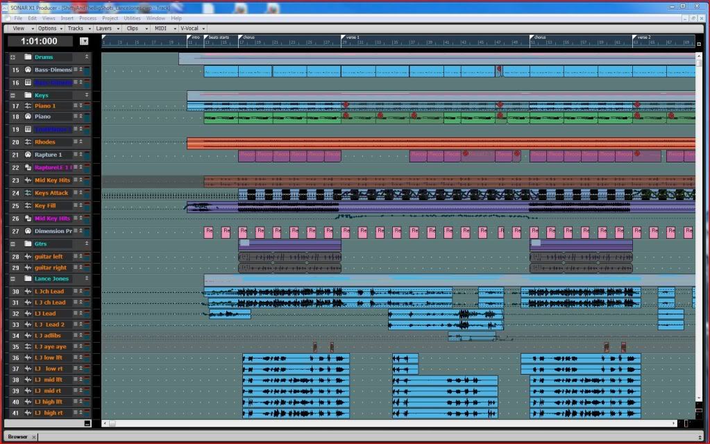 Here is Sonar 8.5.3 with the same project with as many trqcks as in the above or there about. 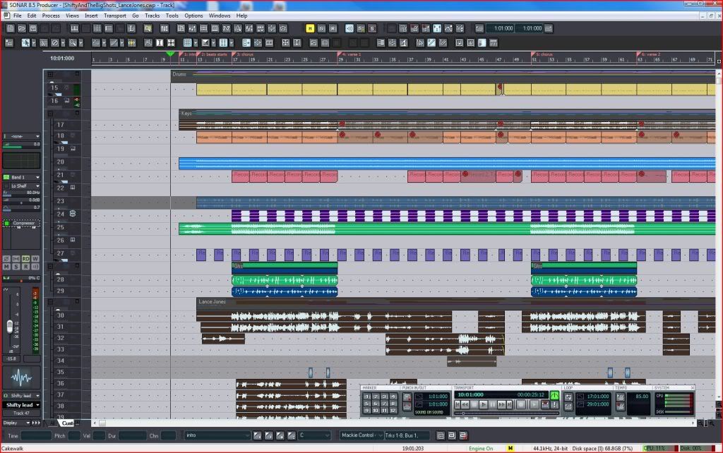
post edited by John - 2011/01/26 14:05:43
|
himalaya
Max Output Level: -85 dBFS

- Total Posts : 282
- Joined: 2006/10/24 12:30:01
- Status: offline
Re:X1 User interface looks cluttered!
2011/01/26 14:48:28
(permalink)
Mod Bod
I wonder if it would have been better to just create a different default track view and console view and advertise that instead.
Something I've mentioned here already. I really think that Cakewlak had put a lot of potential customers off with that default UI. Talking about how the UI can be customised, has anyone seen/worked with Samplitude? It allows to jump from different work screen set ups at a press of a button (not to be confused with X1's screen sets). I can have a lean and mean UI that doesn#t have too many buttons one minute or one with all editing options showing the next, or choose one optimised for mastering (which will included CD bruning option buttons). It really is well concieved. Sonar's (up to X1) customisation was extremely clunky and user unfriendly by comparison.
|
UnderTow
Max Output Level: -37 dBFS
- Total Posts : 3848
- Joined: 2004/01/06 12:13:49
- Status: offline
Re:X1 User interface looks cluttered!
2011/01/26 14:58:55
(permalink)
John
I can show much the same number of tracks in X1 as I did in Sonar 8.5.3.
Both pictures were snapped on a 22" LCD display running at 1680x1080.
< Silly pictures deleted to keep the thread clean>
Oh come on John that is silly. How can you compare these two pictures? In the 8.5 picture you have every toolbar and it's grandma open while in X1 you have everything closed. At least open the Control Bar for a fair comparison. If that wasn't enough, you don't even fully minimise the tracks in the 8.5 view! (And you have the Track Inspector open to make things look even more cluttered). Here are some real hard facts: Sonar 8.5 can show 42 tracks on 1080 vertical resolution. That is 6 more than X1 or a 14.3% screen real estate loss when upgrading to X1 and that is with the Control Bar closed! With CB open you get a 21.4% loss of screen real estate. More than a fifth. X1 wastes space needlessly. Fact, not opinion. Still, Cubase clearly wins with the ability to show 65 tracks on the same screen. UnderTow
|
Brandon Ryan [Roland]
Max Output Level: -40.5 dBFS

- Total Posts : 3458
- Joined: 2003/11/06 03:29:12
- Location: Los Angeles, CA
- Status: offline
Re:X1 User interface looks cluttered!
2011/01/26 15:06:58
(permalink)
UnderTow
John
I can show much the same number of tracks in X1 as I did in Sonar 8.5.3.
Both pictures were snapped on a 22" LCD display running at 1680x1080.
< Silly pictures deleted to keep the thread clean>
Oh come on John that is silly. How can you compare these two pictures? In the 8.5 picture you have every toolbar and it's grandma open while in X1 you have everything closed. At least open the Control Bar for a fair comparison. If that wasn't enough, you don't even fully minimise the tracks in the 8.5 view! (And you have the Track Inspector open to make things look even more cluttered).
Here are some real hard facts: Sonar 8.5 can show 42 tracks on 1080 vertical resolution. That is 6 more than X1 or a 14.3% screen real estate loss when upgrading to X1 and that is with the Control Bar closed! With CB open you get a 21.4% loss of screen real estate. More than a fifth.
X1 wastes space needlessly. Fact, not opinion.
Still, Cubase clearly wins with the ability to show 65 tracks on the same screen.
UnderTow
Look I'll be the first to admit that I think the CB is a bit too big (that's only my personal opinion). The good part of this is that it can be instantly hidden most of the time and easily shown when needed. Either way this is something that will no doubt have work done on it as time goes by. But let's not make a direct connection between number of tracks visible at one time as an indicator of how good or bad a UI is. There's a lot more to the equation and for some, these factors are going to far outweigh being able to see less tracks by some percentage.
"The sky above the port was the color of television, tuned to a dead channel." WG SONAR Platinum | VS-700 | A-800 PRO | PCAL i7 with SSD running Windows 8 x64 | Samsung 27" LCD @ 1920x1080 | Blue Sky monitors with BMC | All kinds of other stuff
|
JClosed
Max Output Level: -77 dBFS

- Total Posts : 690
- Joined: 2009/12/19 11:50:26
- Status: offline
Re:X1 User interface looks cluttered!
2011/01/26 15:12:07
(permalink)
@UnderTow So - software that is projecting a track as a single line giving you 1600+ tracks on a 1680x1080 monitor is per definition superior to all other DAW software? Hmm.. interesting... Never tought you could see things like that. Well - I am never to old to learn... But... If you don't mind - I just go for X1, just because I like it. It has everything I need, it is working like I want it to, the interface is fitting my style and I don't care about the "number of tracks on screen competition". That's enough for me... 
|
UnderTow
Max Output Level: -37 dBFS
- Total Posts : 3848
- Joined: 2004/01/06 12:13:49
- Status: offline
Re:X1 User interface looks cluttered!
2011/01/26 15:19:25
(permalink)
Brandon Ryan [Cakewalk
]
Look I'll be the first to admit that I think the CB is a bit too big (that's only my personal opinion). The good part of this is that it can be instantly hidden most of the time and easily shown when needed. Either way this is something that will no doubt have work done on it as time goes by.
Great. See my multiple Control Bar Modes suggestion above.
But let's not make a direct connection between number of tracks visible at one time as an indicator of how good or bad a UI is.
Why not? Because you don't think it is important? It certainly is an important indicator for anyone that wants to have as much as possible visible in one go. Instead of telling the users what is or isn't an important indicator, maybe Cakewalk should listen to what the users consider important indicators. This is one of them. There's a lot more to the equation and for some, these factors are going to far outweigh being able to see less tracks by some percentage.
What does this have to do with anything? You are presenting this as though having the ability to make your tracks really small prevents other stuff. It doesn't. This is a false dichotomy. Cakewalk just designed a new GUI. Why is the smallest track size so big? Why not give the option for much smaller tracks like other DAWs do? If people want bigger tracks, nothing is stopping them from making them bigger (like John did with his 8.5 screenshot). It can even be the default setting. That is fine. Seriously Brandon, I don't see how you can argue against having the ability to have smaller tracks. Some people want that. Anyone else can use larger tracks. UnderTow
|
tarsier
Max Output Level: -45 dBFS
- Total Posts : 3029
- Joined: 2003/11/07 11:51:35
- Location: 6 feet under
- Status: offline
Re:X1 User interface looks cluttered!
2011/01/26 15:22:34
(permalink)
Which version of Sonar shows more information in the track view header? 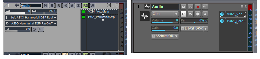 What on earth does "LftASHDRA" even mean...?
|
Brandon Ryan [Roland]
Max Output Level: -40.5 dBFS
- Total Posts : 3458
- Joined: 2003/11/06 03:29:12
- Location: Los Angeles, CA
- Status: offline
Re:X1 User interface looks cluttered!
2011/01/26 15:33:36
(permalink)
UnderTow
Brandon Ryan [Cakewalk
]
Look I'll be the first to admit that I think the CB is a bit too big (that's only my personal opinion). The good part of this is that it can be instantly hidden most of the time and easily shown when needed. Either way this is something that will no doubt have work done on it as time goes by.
Great. See my multiple Control Bar Modes suggestion above.
But let's not make a direct connection between number of tracks visible at one time as an indicator of how good or bad a UI is.
Why not? Because you don't think it is important? It certainly is an important indicator for anyone that wants to have as much as possible visible in one go. Instead of telling the users what is or isn't an important indicator, maybe Cakewalk should listen to what the users consider important indicators. This is one of them.
Well I do think it's important but what I'm saying is that it may not be as important to everyone as you personally feel it is. To be honest I don't have poeple coming up to me left and right and saying they need to see more tracks. It's important to some yes but how important it is and to what extent it should be focused on is arguably all over the map. I was simply saying let's not remove it from the overall equation and make it an singular indicator of how well or how poorly designed the UI is. There's a lot more to the equation and for some, these factors are going to far outweigh being able to see less tracks by some percentage.
What does this have to do with anything? You are presenting this as though having the ability to make your tracks really small prevents other stuff. It doesn't. This is a false dichotomy.
No I'm not saying that at all. I'm questioning how much design and development focus this particular factor should take. I wasn't saying at all that it prevents anything, just that there are other factors as well as number of visible tracks that make an interface more or less pleasurable to use. Cakewalk just designed a new GUI. Why is the smallest track size so big? Why not give the option for much smaller tracks like other DAWs do? If people want bigger tracks, nothing is stopping them from making them bigger (like John did with his 8.5 screenshot). It can even be the default setting. That is fine.
Because it takes design, development and testing time. Thi is something I've had to come to terms iwth while working for music technology companies over the years. We've been through this before. It's easy to throw an idea on the table and ask why it wasn't implemented. And you know we appreciate thoughtful good ideas. But as soon as you say "why not give the option" you are adding design, develpment and testing time to the product. Seriously Brandon, I don't see how you can argue against having the ability to have smaller tracks. Some people want that. Anyone else can use larger tracks.
UnderTow
I never meant to give the impression that I'm arguing against having the ability to have smaller tracks - that would be absurd.  What I was saying is that the current lack of ability doesn't inherently make it a bad UI or outweigh the positive aspects of X1's interface. I was cautioning against putting too much emphasis on his particular aspect.
"The sky above the port was the color of television, tuned to a dead channel." WG SONAR Platinum | VS-700 | A-800 PRO | PCAL i7 with SSD running Windows 8 x64 | Samsung 27" LCD @ 1920x1080 | Blue Sky monitors with BMC | All kinds of other stuff
|
Guest
Max Output Level: -25.5 dBFS

- Total Posts : 4951
- Joined: 2009/08/03 10:50:51
- Status: online
Re:X1 User interface looks cluttered!
2011/01/26 15:38:43
(permalink)
Brandon Ryan [Cakewalk
]
Because it takes design, development and testing time.
It doesn't take dev time to get what you already had. You had already gone 2 years without serious work on Sonar, why not do another paid fix, call it 9 and do a proper X1 in 2011? A 11/11/11 launch? That would have solved 99% of this.
|
John
Forum Host
- Total Posts : 30467
- Joined: 2003/11/06 11:53:17
- Status: offline
Re:X1 User interface looks cluttered!
2011/01/26 15:41:53
(permalink)
UnderTow
John
I can show much the same number of tracks in X1 as I did in Sonar 8.5.3.
Both pictures were snapped on a 22" LCD display running at 1680x1080.
< Silly pictures deleted to keep the thread clean>
Oh come on John that is silly. How can you compare these two pictures? In the 8.5 picture you have every toolbar and it's grandma open while in X1 you have everything closed. At least open the Control Bar for a fair comparison. If that wasn't enough, you don't even fully minimise the tracks in the 8.5 view! (And you have the Track Inspector open to make things look even more cluttered).
Here are some real hard facts: Sonar 8.5 can show 42 tracks on 1080 vertical resolution. That is 6 more than X1 or a 14.3% screen real estate loss when upgrading to X1 and that is with the Control Bar closed! With CB open you get a 21.4% loss of screen real estate. More than a fifth.
X1 wastes space needlessly. Fact, not opinion.
Still, Cubase clearly wins with the ability to show 65 tracks on the same screen.
UnderTow
For the record I do not have every tool bar open in the 8.5.3 picture. But closing them or more accurately removing them would cut down on my ability to do the things I wish to do. Where X1 does not need those tool bars and still those things can be done. In Sonar 8.5.3 many things are not removable as well where in X1 they are. The way I have those examples are the way I can effectively work with the to versions. Its my "work flow" LOL
|
John
Forum Host
- Total Posts : 30467
- Joined: 2003/11/06 11:53:17
- Status: offline
Re:X1 User interface looks cluttered!
2011/01/26 15:46:14
(permalink)
Look I'll be the first to admit that I think the CB is a bit too big (that's only my personal opinion). The good part of this is that it can be instantly hidden most of the time and easily shown when needed. Either way this is something that will no doubt have work done on it as time goes by. One of the neat things in X1 is the support of a CS. You don't need the CB open at all with one if it is a Mackie Control or a V-700. That is one that will display time and position as well as tracks plus status.
|
The Maillard Reaction
Max Output Level: 0 dBFS
- Total Posts : 31918
- Joined: 2004/07/09 20:02:20
- Status: offline
.
post edited by Splat Chat O'samplemashy - 2018/12/21 17:18:12
|
The Maillard Reaction
Max Output Level: 0 dBFS
- Total Posts : 31918
- Joined: 2004/07/09 20:02:20
- Status: offline
.
post edited by Splat Chat O'samplemashy - 2018/12/21 17:18:39
|
UnderTow
Max Output Level: -37 dBFS
- Total Posts : 3848
- Joined: 2004/01/06 12:13:49
- Status: offline
Re:X1 User interface looks cluttered!
2011/01/26 15:56:34
(permalink)
Brandon Ryan [Cakewalk
]
Why not? Because you don't think it is important? It certainly is an important indicator for anyone that wants to have as much as possible visible in one go. Instead of telling the users what is or isn't an important indicator, maybe Cakewalk should listen to what the users consider important indicators. This is one of them.
Well I do think it's important but what I'm saying is that it may not be as important to everyone as you personally feel it is.
Of course. Note that you responded to a post I made in response to John. John posted misleading pictures that give the wrong impression. That just irks me. Hence my response. Also note that this is a thread about GUI clutter. Not other aspects of UI design.
I was simply saying let's not remove it from the overall equation and make it an singular indicator of how well or how poorly designed the UI is.
Again, I was responding to a really silly post. That said, It IS important. Especially as the GUI just got redesigned. No I'm not saying that at all. I'm questioning how much design and development focus this particular factor should take.
Oh come on Brandon. Making all the buttons and track heights etc smaller to start with does NOT use any more development resources. They are just pictures in the end. Nothing more. Because it takes design, development and testing time.
No it doesn't. There is no way you are going to make me believe that shaving of a few pixels off everything has any bearing on how long it takes to design a GUI. On the other hand, getting things right from the start does save design, development and testing time along the line. Thi is something I've had to come to terms iwth while working for music technology companies over the years. We've been through this before. It's easy to throw an idea on the table and ask why it wasn't implemented. And you know we appreciate thoughtful good ideas. But as soon as you say "why not give the option" you are adding design, develpment and testing time to the product.
Not in this case. The option is already there. Tracks can be resized. I just think they should start smaller. Now on the other hand if I suggested there was the ability to resize tracks to much smaller heights but to do this the track view would have to switch below a certain size to a view that removes all the widgets and track names... then you would have a point. (Pro Tools does that). I never meant to give the impression that I'm arguing against having the ability to have smaller tracks - that would be absurd. What I was saying is that the current lack of ability doesn't inherently make it a bad UI or outweigh the positive aspects of X1's interface. I was cautioning against putting too much emphasis on his particular aspect.
It is important you know. UnderTow
|